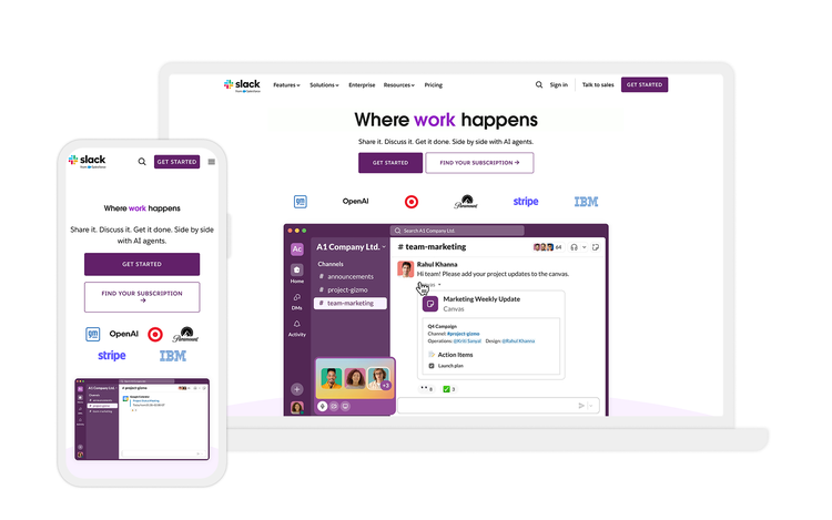
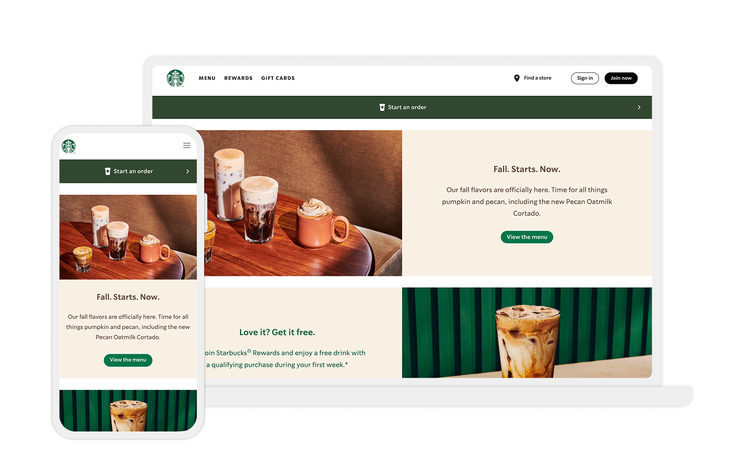
Now that you’ve learned what responsive web design is and seen examples of what it looks like, let’s explore some best practices.
Prioritize content.
Make sure users can find the content they’re looking for with minimal scrolling or browsing. While viewing website information on desktop may require less scrolling, viewing the same information on a mobile device can result in a poor user experience if the content is long and the font or imagery is not modified to fit the screen.
Remember to create content that fits within the specified viewport so consumers can locate the information they’re looking for easily.
Reduce friction.
Start by identifying the main goal of the page and design with that purpose in mind. Avoid overwhelming users with too many calls to action. You’ll need to tailor each site version to the user’s needs. A mobile-first design approach helps designers understand and decide what’s necessary to include on the website so that the company’s main objective is achieved. An example of a main objective could be the purchase of a product or a service.
When it’s time to build the tablet and desktop versions of the website, you can start thinking about secondary objectives. This can include adding prompts for signing up to a newsletter to encourage purchases later — and deciding which CTAs and micro-interactions will make that possible. The most important thing is to focus on the primary objectives of the user first, then eliminate any unnecessary friction that doesn’t aid the primary or secondary goals.
Think about thumbs.
Make sure the important parts of the page are easily reachable for a person using their thumb on a mobile phone. The main difference between desktop and mobile users is that the former typically have their computers on a surface, whereas the latter hold their devices in their hands.
This significantly changes the way web designers create tap targets and other elements that users interact with. For example, people typically expect the main desktop navigation to be at the top. But on mobile, it should be in the middle or at the bottom since people can’t reach the top comfortably with their thumbs.
Design and develop together.
Remember that responsive web design is an approach that pushes for both design and development to respond to the user’s behavior and environment, so it’s important that they work together effectively. Designers and developers collaborate to determine how content should be shuffled and what the result will look like.
By designing and developing together, you can:
- Boost readability
- Increase time spent on the website
- Enhance interactions
- Improve ecommerce sales
- Make the overall user experience better
To put responsive web design into practice, you’ll need to start by gathering information, organizing the structure, and designing what the website will look like. Then you can test and launch a beta version of your site.
Make it structural.
Responsiveness must be built into your processes and your systems, not just for a web page or a specific marketing campaign. Web designers should focus on responsiveness and functionality at a component level.
Instead of thinking about an entire product page, think through how the marquee on a product page works responsively. Think about the cards, carousels, and calls to action. Consider what it takes for each component to shine in different viewport widths and screen resolutions. Then, when design teams receive page development requests, they already have the components ready to go and can focus on specific page content to complete the user experience.
Test repeatedly.
It’s vital to conduct usability testing across platforms on a regular basis. Test for navigation on the website — as the device changes, the navigation bar should change with it. It’s necessary to test the navigation designs on different screens and verify that it’s not leading to a poor user experience.
You can also test fonts on multiple devices. You may want to use different fonts and design methods for the content on your website. However, these fonts may not be supported universally — causing them to appear as random characters or codes on a consumer’s device. Remember to test the fonts on multiple devices before launching the update on your website.
Be sure to test device-browser combinations. You can analyze the web and mobile traffic from Google Analytics and include the browsers that are most used to visit your website. Finally, test the speed of your website, considering load time of different pieces of content, such as images and videos on different devices.


