Web designers, marketers, business owners, and executives need to ensure that their websites provide a positive customer experience that encourages repeat visits and maximizes conversions. You can take inspiration from the great web design examples in this guide to meet your customer experience and conversion goals.
These sites have received recognition from professional web design and development bodies like Awwwards and the Webby Awards. Look through our list of outstanding web design examples to see how your site compares and if it needs a refresh to stay competitive.
This post will highlight:
- Award-winning websites in 2023
- Award-winning websites from 2022
- Additional website designs to motivate you in 2023
Award-winning websites in 2023
Whether you’re planning your first web design project or revamping an existing site, these award-winning website designs can provide the necessary creative fuel to jump-start your efforts. Here are some of the best website designs making a splash early in 2023.
Lacoste Heritage
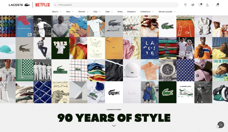
Lacoste Heritage received Site of the Day (SOTD) recognition from Awwwards in April 2023. Take one look at the site, and you’ll see why it caught the eye of the Awwwards experts.
From the moment the site loads, Lacoste Heritage overwhelms the visitor in a pleasing way with big, bold, and engaging imagery. The platform shows off some of the clothing brand’s most popular offerings and provides a seamless browsing experience.
Awwwards rated Lacoste Heritage high for usability and overall design. As users scroll down the page, they come across on-brand imagery, intriguing links like “The Man of Many Talents,” and concise snippets of text designed to keep them engaged. The site doesn’t just route users to product pages, either. It also directs them to “About Us” content and other materials specifically curated to strengthen purchasing intent.
RCA Records

As the second-oldest record label in the world, RCA Records has a long and storied history of being a trendsetter. But it has outdone itself with its latest website overhaul — and Awwwards agreed, which is why it awarded the new site SOTD honors in April 2023.
RCA took some major risks with this website, but the acclaimed label pulled it off. The site is ambitious, interactive, and dynamic. It features a fast-moving image gallery at the top of the home page, highlighting today’s most popular artists and the icons of yesteryear.
Throughout the page, visitors can find links to music videos, articles, and plenty of other content to keep them engaged. Notably, RCA Records included a clever 404-page beat sampler feature that reads, “This page doesn’t exist. Make a beat instead.”
Unseen Studio
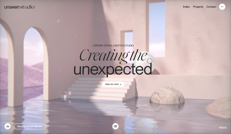
Unseen Studio boasts one of the best website designs of 2023. Awwwards recognized the visionary digital and motion studio’s site by giving it February 2023 Site of the Month (SOTM) honors. While there’s plenty of time for other brands to launch new sites this year, Unseen Studio has set the bar high.
When designing the site, Unseen Studio opted for a mix of soft colors and bold text to draw visitors’ attention to core site elements. As users move their cursors around the home page, the screen view shifts slightly. When the cursor passes over the menu text, the lettering changes colors and shimmers.
These complementary features capture users’ attention immediately and provide an interactive, one-of-a-kind browsing experience.
Sprite — “Hall of Zero Limits”

Sprite kicked off 2023 with a conspicuous bang by launching its “Hall of Zero Limits.” The page earned Sprite Awwwards’ first 2023 SOTM honor by giving visitors the opportunity to meet some of the minds behind the popular film Black Panther: Wakanda Forever.
The Hall of Zero Limits is an immersive, interactive page that’s jam-packed with dynamic content. Once the page loads, users are prompted to enter the hall. At the center of the great hall is a tree flanked by digital billboards featuring members of the Wakanda Forever cast and crew.
These types of over-the-top visuals and on-brand color schemes are among the attributes that make the “Hall of Zero Limits” one of this year’s best website designs.
Curious & Company
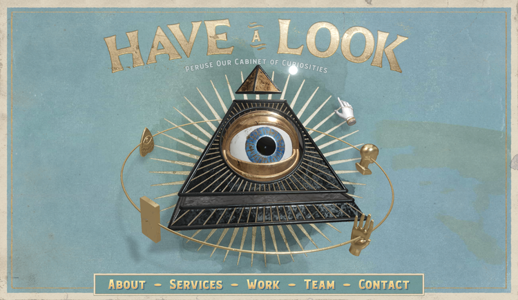
Rounding out the list of 2023 honorees is Curious & Company, which also was recognized by Awwwards as a Site of the Day.
The opening frame of this website is an ode to the ever-popular mystery genre. As users move their cursors around the screen, a small segment of the background imagery becomes illuminated. This design element prompts users to explore the entire page and take in every perfectly crafted detail.
Those curious enough to navigate past the main page are greeted by an all-seeing eye, which maneuvers about the screen in an elliptical pattern. Below the eye is the site’s menu, which features Service, About, and Contact tabs. The site does a great job of drawing users’ attention to the right elements while keeping them engaged and preventing their minds from wandering.
Award-winning website designs from 2022
Now that we’ve seen some standout 2023 web designs, let’s take a look back at award-winners from last year. Here are a few of the best examples:
Hyer

If striking imagery is what you’re after, Hyer can serve as an excellent source of inspiration.
The platform provides tailored aviation solutions, connecting passengers with shared flight and personalized aircraft booking options. Hyer has paired its transparent, no-frills service model with a crisp, clean website that appeals to prospective customers at all stages of the purchasing process. It also was named Website of the Month by the CSS Design Awards.
Like all the best website designs, Hyer greets users with captivating visuals — a sleek private jet slowly transitions from left to right across the user’s screen while they take in the site. The home page also makes good use of negative (i.e., white or blank) space to avoid overwhelming users.
Hyer’s site has a catchy tagline, an easy-to-use navigation bar, and a no-nonsense call to action (CTA). In this way, it’s the perfect example of the power of simplicity.
FPP

Next up on our list of 2022’s best website designs is FPP, another CSS Design Awards honoree.
FPP classifies itself as a “shopper marketing agency,” which is an apt description by the looks of its website. The agency designs immersive virtual reality shopping experiences and marketing content for ecommerce retailers. It also offers complimentary design services that help online stores provide their customers with a frictionless buying experience.
The website’s background mimics the aisle of a grocery store. Instead of traditional scrolling, the site shows users around by empowering them to “walk” down the aisle. As they progress through the store, the screen shifts to showcase specific items on the shelves, each highlighting one of FPP’s services.
The website doesn’t rely on loud colors or hyperbolic imagery but instead incorporates softer tones to create an aesthetically pleasing digital environment and an enjoyable user experience.
Mubasic

Mubasic was named Awwwards Website of the Day on August 10, 2022. The site is compelling, interactive, and engaging. Mubasic is a music catalog for children. Every aspect of its website conveys lighthearted playfulness with a little touch of zen.
One of the most important factors to consider when designing websites is tone. Your site’s general tone and scheme must represent your overarching mission and values. Mubasic’s site designers have mastered these concepts. Every aspect of the site feels authentic and approachable, from its home page to the submenus.
One of the most interesting features of the site is its unique Q&A section. As you scroll down the page, images pop up to accompany each question and answer.
The page closes things out with a new customer form and contact information. These gentle CTAs align with the rest of the website’s vibe, making it a seamless way to funnel in new users.
Additional website designs to motivate you in 2023
The web is filled with wonderful site designs that can wow the senses and inspire your brand. If you’re looking for additional ideas to help you channel your inner web designer, we recommend looking at sites like:
- Superlist
- Spotify Design
- 1917: In the Trenches
- The Octopus: A design blog by IDEO
- Nomadic Tribe
- Diana Danieli
- George Nakashima Woodworkers
- Frans Hals Museum
- Crypton.trading
- NOWNESS
- Simply Chocolate
- Zillow
- Rainforest Guardians
- ETQ
- Woven Magazine
- Feed
1. Superlist

The productivity app Superlist boasts not only an intuitive mobile application but also an award-winning website. In April 2021, Superlist earned SOTM honors from Awwwards. While it’s been a couple of years since Superlist received some well-deserved recognition, it remains one of the best designed sites out there.
If you’ve ever been to a website that failed to make it clear what the brand’s mission or objectives were, you probably didn’t stick around too long. Superlist makes it perfectly clear that the company is focused on optimizing its clients’ productivity. The interactive home page features headphones, a keyboard, and no-nonsense copy that delivers the brand’s mission.
The website also uses a small but easy-to-locate button that encourages readers to scroll down. Below the opening frame, users can learn more about the brand and its various services.
2. Spotify Design
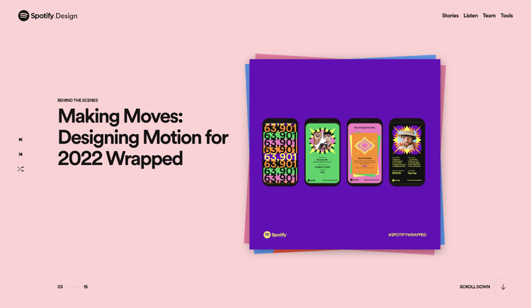
For our next best website designs award winner, we’re going back to 2020. That’s when Spotify Design received an Honorable Mention from Awwwards for its vibrant website.
From top to bottom, Spotify Design is filled with seamless animations, drop shadows, and abstract elements that make images appear three-dimensional. While the platform was already dominating the music-streaming market before the launch of its dynamic website, Spotify Design further solidified its place as the top streaming service.
At its core, the website is a robust conversion tool. It demonstrates all the elements that make the Spotify app so popular. From Q&A about the user experience to glimpses into the application’s features and menus, Spotify Design has everything you could possibly want from a great website — and then some.
3. 1917: In the Trenches

In 2019, 1917: In the Trenches earned Awwwards’ Website of the Day prize. Intended to promote the film 1917, In the Trenches lets users explore WWI trenches and follow the path of the movie’s core protagonists. Users can even access the tools or read some of the maps referenced in the motion picture.
1917: In the Trenches stands out because of its interactivity and expert usage of the film’s established storyline. Launching the site ahead of the much-anticipated movie generated plenty of intrigue about the project. Despite having no marquee stars, the film did well at the box office.
If you want to imitate this winning website design, focus on making your pages interactive and tie those elements into your brand’s mission, story, values, and aesthetic.
4. IDEO — The Octopus design blog
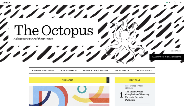
IDEO is a well-known global design company that has produced some truly innovative content. One of its most notable designs was The Octopus, which was deployed on IDEO’s in-house blog library. The Octopus provides visitors a glimpse into “a designer’s view of the universe” and features a balanced mix of yellow, black, and white to create a minimalistic yet visually interesting page.
In 2019, The Octopus earned a Business Blog/Website award from Webby. One of the elements that won over Webby is the site’s interactive menu.
When users hover over a particular image, it draws closer to the screen, which is a great trick for boosting engagement. Blog post titles are highlighted in yellow when users move their cursors over the content. Fittingly, a black-and-white octopus drawing is the centerpiece of IDEO’s Octopus design.
5. Nomadic Tribe

Nomadic Tribe connects visitors with opportunities to book life-changing visits to locations inhabited by indigenous tribes around the world. The website is as unique and fascinating as the organization and its mission.
As soon as users arrive on the home page, Nomadic Tribe connects with their sense of adventure by playing a high-definition video of an individual traversing the desert. Throughout the video, viewers are presented with short snippets of text that play to their emotions and speak to their desire to see the world.
The Nomadic Tribe website demonstrates expert usage of calls to action. Site designers use CTAs created for customers in all phases of the purchasing funnel. When targeting top-of-funnel leads, the site uses gentler, non-committal calls to action like “Read more” or "Watch now.” Users that make it deeper into the site are targeted with more direct CTAs such as “Download the app.”
6. Diana Danieli

Diana Danieli brought home a Webby award in 2019 due in large part to its sleek architecture, high-contrast imagery, and engaging layout. Visitors can browse stunning photos, open menus, and learn more about the successful artist who manages the website.
The beautiful artistic pieces highlighted on the site can inspire, captivate, and intrigue on their own. Even so, website designers wisely chose to elevate these eye-catching pieces of visual content with music and other audio overlays.
By combining captivating sights and sounds on your website, you can maximize the efficacy of your design. But as always, the tone and style of your design elements must complement one another.
7. George Nakashima Woodworkers

Woodworking is a centuries-old practice with a rich and remarkable history. The George Nakashima Woodworkers website pays homage to this history while emphasizing natural elements such as trees and other greenery.
The foundational component of the site is a slideshow of farming imagery and forestry scenes. These pictures are enhanced with quotes related to woodworking, nature, and trees. The George Nakashima Woodworkers website earned a Webby in 2019, which recognized its user-friendly design and understanding of the brand’s target audience. The imagery puts visitors at ease while demonstrating that woodworkers respect the beauty of the world around them.
While there’s much to be learned from the George Nakashima Woodworkers site, the most important lesson is that brand leaders and web designers must know their target audiences well. When you have a solid grasp of who you’re trying to reach, you can develop a great site that sticks out in users’ minds and drives meaningful traffic for your brand.
8. Frans Hals Museum
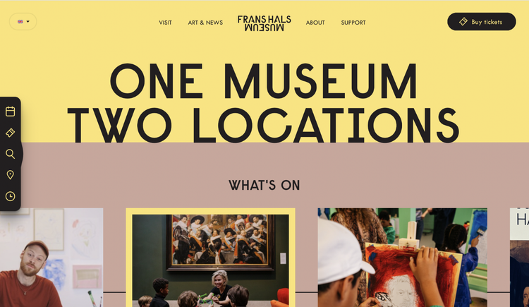
With so many great websites on the internet, earning Site of the Year (SOTY) honors is a major achievement, especially when the award-winner is a museum.
In 2018, Awwwards identified the Frans Hals Museum as its SOTY winner, which attests to the user-friendly nature of the site. Somehow, designers managed to present all of the Dutch museum’s artwork on one website without making it feel crowded, clunky, or overwhelming.
What makes the site truly innovative is that it combines in-house exhibits with digital design elements. This hybrid approach gives site visitors a sneak peek of what they can see and experience at the Frans Hals Museum. In addition to sharing information about the museum’s exhibits, the site also relays information about upcoming events, which further increases engagement and helps the organization optimize visitor volume.
9. Crypton.trading

In April 2018, Crypton.trading earned Site of the Day honors from Awwwards. Crypton.trading provides users with an intuitive hub for trading popular cryptocurrencies like Ethereum and Bitcoin.
Awwwards reviewers were especially appreciative of the site’s development and design elements, which include bold, blocky letters and a clear description of what the site does. The site differentiates itself from similar hubs by including a machine learning-powered cryptocurrency trading bot that helps users complete transactions with minimal effort.
Along with machine learning, Crypton.trading uses artificial intelligence (AI) technology to highlight buying and selling opportunities for customers. Together, AI and machine learning empower the trading bot to predict changes to a coin’s value. Users can take advantage of these insights to guide trading habits and capitalize on crypto that’s trending upward.
10. NOWNESS
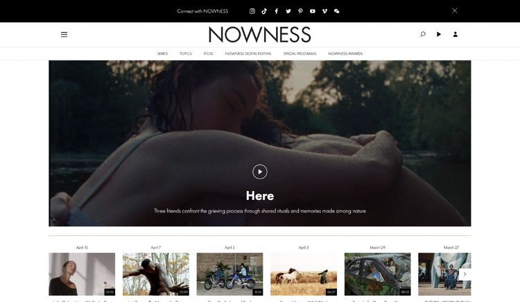
In 2017, NOWNESS launched its captivating website, which doubles as a crowdsourced video blog. As the name implies, crowdsourced video blogs like NOWNESS source the majority of their content from independent creators who submit a steady stream of visually compelling footage.
It’s a brilliant design model that benefits both parties — aspiring vloggers get a home for their videos, and NOWNESS gets free content. At the time, NOWNESS’s model was unique, which is one of the reasons it won the Best Cultural Blog/Website Webby Award the year it was launched. Since 2017, however, many other sites have adopted similar user-centric content creation models.
Regardless, NOWNESS remains a shining example of how brands can merge user-submitted materials with content to strengthen engagement. The channel also has the distinction of being one of the pioneers of this fresh and exciting form of content sharing.
11. Simply Chocolate

If you’re trying to cut back on sweets, steer clear of the Simply Chocolate website — a few seconds on its page will have you hungry for high-quality candy. Simply Chocolate earned Site of the Year honors from Awwwards in 2017, thanks to its creative product names and use of a broad color palette.
Even though the Denmark chocolate maker makes use of a multitude of dazzling colors to flex its creativity, every page exhibits consistent branding and design features. When designing this award-winning website, the Simply Chocolate team took things to the next level by employing three-dimensional imagery — each product appears real enough to pull right out of your screen. These true-to-life images feature drop shadows, small tears, and wrinkles in the wrappers.
For the CTA, Simply Chocolate elected to keep things sleek and succinct. Product prices are displayed in small lettering just above the CTA box, which simply reads “Add to Box.”
12. Zillow
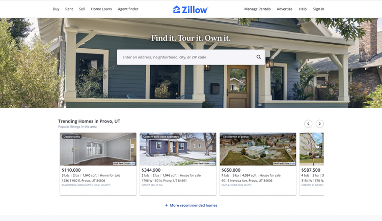
Zillow is a nationally known rental and real estate digital marketplace that parlayed its web design expertise into a Webby Award in 2016. The award recognized the company’s feature-laden, ultra-functional website.
Zillow introduces users to its brand via a simplistic, easy-to-digest home page. But as users navigate the site, they’re exposed to robust features, an assortment of intuitive tools, and other resources designed to help them find their dream homes.
What Zillow does best is incorporate the traditional grid structure onto its maps without distracting from its visual design elements. The platform also makes use of frictionless navigation tools, ensuring that users can easily find the information they’re looking for. Since the launch, Zillow continues to refine its site. Your brand needs to be willing to demonstrate the same kind of industriousness and constant improvement if you want to stay ahead of the competition too.
13. Rainforest Guardians

In 2016, Webby awarded Rainforest Guardians its Best Activism Website honors. The platform was designed to bring awareness to deforestation, a global issue threatening not just existing communities but future generations as well.
The site lends a sense of immediacy to the issue by allowing users to explore waterways and villages within the Amazon rainforest’s beautiful ecosystem, a pristine natural area at risk of being impacted by rampant deforestation.
Like many of the other website designs on our list, Rainforest Guardians’ most appealing element is its interactivity. Consumers love getting to know companies and products with interactive tools and becoming active participants in their brands. You can apply this idea to virtually any vertical, whether you sell physical goods or digital services. Just keep in mind that interactive features aren’t a substitute for responsiveness or great content.
14. ETQ

ETQ is an Amsterdam-based company that manufactures durable sneakers and other footwear. Its flagship offering is a line of leather sneakers for men that combines minimalistic concepts with premium materials. ETQ offers a combination of lace-up and slip-on options, enabling the company to connect with a broader audience.
The website mirrors ETQ’s product line in that it’s minimalistic yet compelling. The flat backgrounds help draw more attention to its products. This approach is brilliant, as it gives visitors exactly what they want — an up-close look at ETQ’s shoe selection.
When designing your own site, remember that your products should always be front and center. Everything else is meant to help promote those products, not distract or overwhelm your audience.
15. Woven Magazine
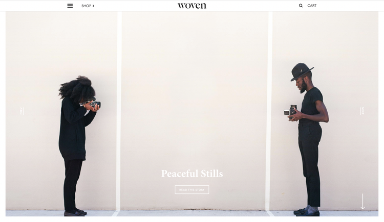
Woven Magazine earned Site of the Day honors from Best Website Gallery back in 2015. The publication recognizes creators, crafters, and artists from around the globe. The content is pure and artistic, which is exactly what Woven’s target audience expects from the established online publication.
Users can peruse Woven’s latest content without being hounded by irritating pop-ups or ads. The site is all about providing users with great experiences so they’ll subscribe to Woven and keep coming back for more.
If you want to make sure your site is inviting, be careful not to bombard users with intrusive ads and overbearing sales attempts. Instead, aim for a more balanced approach that strategically incorporates CTAs when and where they’re appropriate.
16. Feed

Feed is a music property rights platform that uses intelligent software and robust cybersecurity technology to protect users’ ownership of their digital assets.
While the concept behind Feed is unique and somewhat difficult to grasp, the site does an excellent job conveying precisely what the platform accomplishes and who it’s designed for. It pairs direct copy with a moving background to enhance engagement.
The site checks all the boxes in terms of usability, aesthetics, and responsiveness. Software solutions providers should take notes, as they can follow this effective template to educate audiences on their services while keeping them engaged.
Website design ideas
While the leading ecommerce website designs span a broad range of niches, virtually all of them incorporate some tried-and-true techniques. If you want to develop the best and most beautiful website possible, you should follow suit and implement these useful design tips:
- Make it interactive. The top performing websites are intuitive and interactive. Including interactive elements in your website, such as scrolling slideshows and captivating menus, keeps users engaged and encourages visitors to linger on your site. That said, you want to be careful not to overwhelm your audience by making everything interactive and instead focus on a few key elements of your page.
- Prioritize mobile experience. In Q4 of 2022, mobile devices accounted for 59% of global web traffic. Since the majority of site visits originate from smart devices, it’s critical that your site is optimized for mobile. Prioritizing the mobile experience lets you reach more consumers and reduce friction while they’re perusing your site.
- Use photos. A picture is still worth a thousand words — and sometimes far more. Adding images to your website can break up blocks of text, keep users interested, and help reduce bounce rates.
- Pay attention to CTAs. Calls to action provide your customers with clear instructions for what they should do next, whether it’s make a purchase, schedule a demo, or fill out a contact form. While CTAs are integral to a great website, it’s important to structure them strategically. Direct CTAs are best suited for landing and service pages, whereas more subtle CTAs are a better fit for blogs and educational content.
- Easy navigation. Make sure customers can easily find their way around your website. This means implementing bold menu buttons, clear text, and an intuitive layout. Make it easy for visitors to interact with all that great content you publish on your site.
- Integrate with social media. Omnichannel marketing is the process of nurturing leads by interacting with customers across several touchpoints, including your site, paid ads, social media, and more. If you want to make omnichannel marketing part of your mix, integrate your website with your social media channels so visitors can easily follow your pages.
- Maintain consistency. Your site’s tone, style, and user interface (UI) elements must be consistent from page to page. A lack of consistency will diminish a consumer’s perception of your brand and may lead them to question the legitimacy of your site.
- Use a heatmap to test usability. A website heatmap provides a visual representation of visitor behavior on your site. A heatmap shows which sections or elements get the most clicks and do the best job of keeping users’ attention. Hotspots represent your most popular site elements, whereas cool areas of the heatmap reveal elements that may need revamping.
By putting these tips and techniques to use, you’ll be able to build winning website designs that captivate consumers and maximize engagement.
Software to help you create a website design that converts
Great web design helps ensure that your marketing message is delivered effectively and also facilitates conversion for new and returning visitors and customers. If you want to ensure that you have the best web design for your business goals, audit your current site to see how it compares and contrasts with some of the elements on this list of winning sites.
You can audit your commerce website using Adobe’s complementary assessment tool. Once you complete your assessment, Adobe will highlight resources that provide insights for more fully optimizing your website experience.
When you’re ready to really boost your web presence, consider Adobe Experience Manager, a personalizable solution that unites your content and digital asset management needs. Get timely, relevant, and content-led experiences into market faster with Experience Manager, which combines digital asset management with the power of a content management system.
Watch the overview video to learn more about Adobe Experience Manager.

