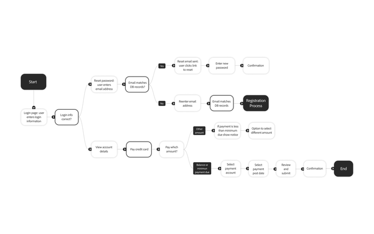
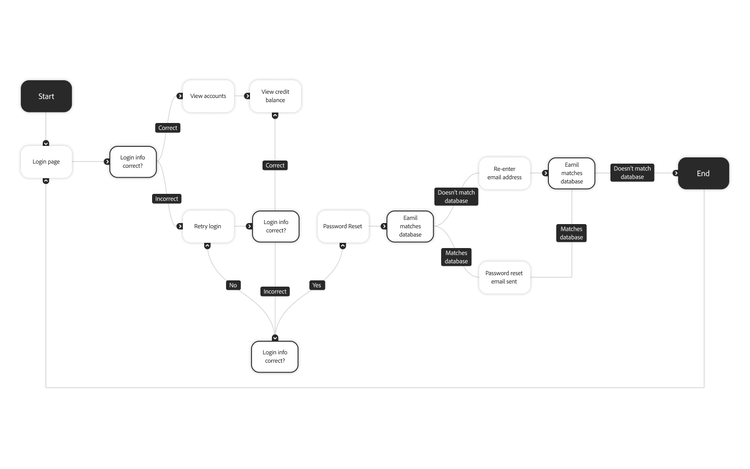
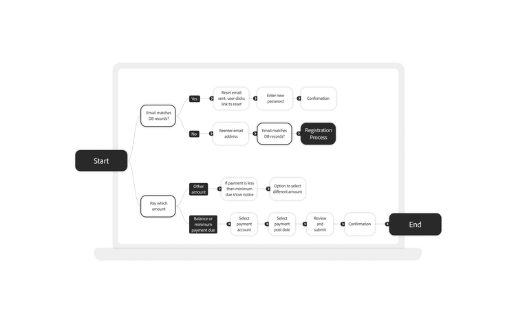
User flow diagrams are an indispensable strategic asset that delivers tangible business value. They provide a structured framework for enhancing user experience, streamlining development, and aligning teams around a shared vision. User flow diagrams are like road maps that help you create the best possible user experience. They accomplish several essential purposes.
Achieve a holistic product view.
During development, teams can become siloed, focusing on individual features or pages without seeing the bigger picture. A user flow diagram provides a crucial bird's-eye view, illustrating how every screen and step functions as part of a larger, interconnected system. This holistic perspective is essential for identifying critical flaws, such as dead ends, orphaned pages, and poorly constructed paths, that degrade the overall user experience and can lead to user drop-off.
Enable low-risk, high-impact optimization.
One of the most significant advantages of a user flow diagram is its ability to serve as a low-cost sandbox for experimentation. Before committing expensive engineering resources, teams can propose, visualize, and debate changes — such as adding a new site section or altering a navigation path — directly on the diagram. This pre-development validation enables teams to identify potential design flaws early, thereby saving considerable time and resources by preventing costly post-launch fixes and rework.
A user flow diagram serves as a universal language that bridges departmental divides. Its clear visual format and simple, standardized conventions make complex processes understandable to all stakeholders, from engineers who need to see the complete logic to sales and marketing teams who want to identify conversion opportunities. This shared understanding makes it an exceptionally efficient tool for gathering diverse feedback and aligning the entire organization on the user's journey.
Ultimately, the user flow diagram functions as a linchpin for business operations. It connects the strategic layer (business goals), the tactical layer (marketing campaigns), and the operational layer (development) of a project. By providing a single source of truth, it reduces ambiguity, minimizes miscommunication between departments, and streamlines the entire product development lifecycle. Its return on investment, therefore, extends far beyond UX improvements to encompass significant gains in operational efficiency and business alignment.
Show how users navigate.
Gain insight into your users’ experience as they navigate your website or app. It’s easy to become so familiar with your company’s product that navigation and user experience seem simple, but that may not be the customer’s experience.
A user flow diagram helps you see your site or app’s flow from a user’s perspective. You can observe what they encounter, identify friction and hurdles, find methods to make the experience seamless, and ensure you align your goals with your users' needs.
Visualize user experience (UX).
A user flow can also provide a bird’s-eye view of your app and illustrate how every piece and page work together. It’s easy to get focused on one part of the website for a specific project or season and lose sight of the big picture. A user flow visualizes the entire experience, allowing you to optimize for every journey.
A user flow diagram helps illustrate how pages and steps work together to bolster or hinder a user's experience navigating your product. With this view, you can easily identify dead ends, orphaned pages, and poorly constructed paths.
When consolidating feedback from multiple team members, especially non-UX colleagues in sales and marketing, a user flow diagram is an efficient way to gather everyone's insights.
Since user flow diagrams are a visual medium, they make it easier to demonstrate app navigation to stakeholders of all departmental backgrounds. A user flow diagram features a simple key of shapes, easy-to-follow paths, and minimal text, allowing critical collaborators to provide their valuable feedback easily.


