Aligning color psychology with AI scoring.

Adobe for Business Team

07-17-2026

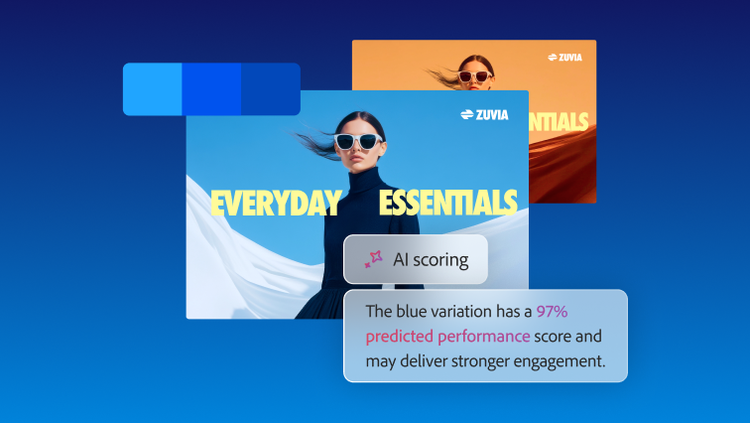
Ad variations showing how AI scoring evaluates color choices and identifies the highest-performing option.

Color psychology has guided creative decisions for marketers for decades. Red signals urgency. Blue indicates trust. Green suggests growth. These associations are widely accepted and often instinctively applied across campaigns.

Colors give creative teams a shared language and a quick solution to align design choices with intent and goals. But modern advertising environments demand more than just symbolic interpretations. This is where AI scoring comes into play.

This is where AI scoring comes into play. It evaluates creative assets based on real-world performance. AI scoring looks beyond what a color is supposed to communicate and focuses on what that color does within a specific ad asset.

AI scoring helps determine how colors affect visibility, readability, engagement, and ultimately, conversion. This takes traditional color theory a step further by making color decisions more performance-led.

Color psychology is still valuable as it offers direction and context, but it works best as a starting point. It should be a way to frame a hypothesis, not a rule to follow without question. AI scoring should be used to test whether that hypothesis holds up when exposed to real audiences, channels, and competitive environments.
Callout defining color psychology and explaining how AI scoring validates color choices in ads.

This article will cover:

What color psychology can and can't predict.

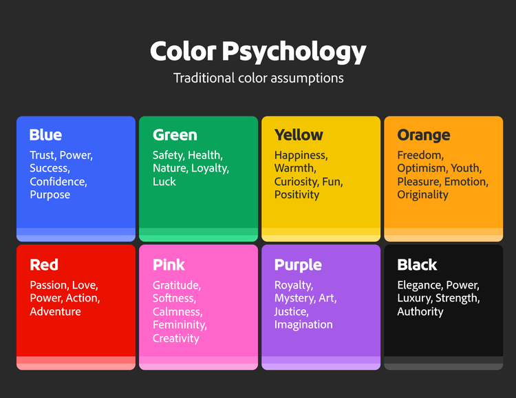
Color psychology is the study of how different colors can influence our emotions, thoughts, and behavior. Although perceptions of color can vary from person to person, certain colors tend to inspire common emotional responses.

For example:

Businesses, designers, and marketers often use color psychology to influence how their brands, products, or experiences are perceived. Choosing the right colors can help communicate a message, create a specific mood, or encourage certain actions.

These choices and traditional attributions are not arbitrary. They are the result of repeated cultural exposure, category conventions, and design patterns that have evolved over time. When applied well, they can help a message land faster and feel more intuitive to the audience.

But they are not universal truths.

The meaning of color changes depending on where and how it is used. Audience expectations, cultural context, product category, platform norms, and even competitor creative all influence how a color is interpreted. A hue that works in one campaign or region may perform differently in another. Factors such as saturation, brightness, contrast, and surrounding colors can also influence perception and decision-making.

More importantly, color alone does not determine performance.

A color might feel emotionally right but still underperform if it interferes with how the creative functions. If text isn’t legible, if the product blends into the backdrop, or if the call-to-action button isn’t visible, the intended meaning becomes secondary.

In practice, this means color psychology has a natural ceiling. It can suggest direction, but it cannot predict outcomes. It tells you what a color may signal. It does not tell you whether that signal translates into attention, engagement, or conversion.

That gap is where performance-based approaches begin to matter.

Color psychology chart showing common emotional associations linked to different colors.

How AI scoring evaluates ad creative.

AI scoring approaches creative from a different angle. Instead of analyzing what a color represents, it evaluates how that color contributes to the ad’s overall effectiveness.

Callout defining AI scoring and how it evaluates ad creative performance.

There are two primary ways this evaluation typically pans out:

In both cases, color is not chosen in isolation. It is chosen strategically as part of a broader system of visual signals, including text and background contrast, consistency with brand guidelines, image clutter, historical performance patterns, and platform, audience, and funnel-stage context.

Bringing color psychology and AI scoring together.

The true value for digital marketers and creative teams is found when color psychology and AI scoring are used together to ensure a fully informed approach to content.

While color psychology provides a lens for approaching creative direction, AI scoring tests whether that direction performs under real conditions. When used together, they create a more complete decision-making framework.

Where color psychology and AI scoring align.

There are many situations where traditional color theory and performance data reinforce each other.

For example, a high-contrast accent color can draw attention to a call to action and make it easier for users to take the next step. Consistent use of brand colors can strengthen recognition across channels and improve recall over time. Colors that align with category expectations can reduce cognitive load and help the audience process the message more quickly.

In these cases, color psychology works because it supports clarity and intent and strengthens the message rather than competing with it. The creative choices fit the brand, appeal to the senses of the audience, improve readability, support campaign goals, and drive measurable results.

Where AI scoring challenges color theory.

There could also be instances where creative performance data may challenge long-held assumptions. A color may carry the 'accurate' symbolic meaning but still fail to perform in context.

For example, a red CTA might attract attention, but if it overwhelms or distracts from the core offering, it can reduce effectiveness. A blue-heavy design may feel trustworthy, but it might feel overused within certain categories. A black palette may signal premium positioning, but it can reduce readability in certain formats.

These are some situations where traditional assumptions fall short. AI scoring fills the gap by showing how color interacts with other variables such as layout, contrast, density, and placement. It shows whether the intended meaning translates into a functional advantage.

Color theory vs. AI scoring: A comparison.

Traditional color assumption
Why marketers use it
What AI scoring may reveal
What marketers should test
Red creates urgency
Used for sales, limited time offers, alerts, and CTAs because it feels active and attention-grabbing.
Red may increase attention, but it can also feel aggressive, reduce trust, or pull focus away from the product or offer.
Test red CTA vs. brand-color CTA vs. high-contrast neutral CTA. Compare CTR, conversion rate, and bounce or drop-off behavior.
Blue builds trust
Common in B2B, finance, healthcare, and tech because it feels stable, professional, and reliable.
Blue may support trust, but it can also feel generic or blend into competitor creative, especially in saturated categories.
Test blue as a dominant brand color vs. blue as an accent color. Compare recall, engagement, and conversion quality.
Green signals growth or sustainability
Used for wellness, finance, environmental messaging, health, and “positive outcome” campaigns.
Green may work only when it matches the product, offer, and audience expectations. In other contexts, the meaning may feel unclear.
Test green creative against category-neutral or brand-led palettes. Compare engagement by audience segment and funnel stage.
Yellow or orange grabs attention
Used to create warmth, optimism, energy, or promotional emphasis.
Bright warm colors may attract attention, but high saturation can reduce readability or make creative feel less premium.
Test saturation levels, background use, and offer label color. Compare attention metrics with conversion outcomes.
Black feels premium
Used for luxury, sophistication, exclusivity, and high-end positioning.
Black may support premium perception, but it can reduce readability or feel too heavy depending on format and contrast.
Test dark palette vs. light palette vs. mixed contrast treatment. Compare engagement, readability, and downstream conversion.

How AI reshapes brand color psychology.

AI scoring does not replace brand color psychology — it strengthens decision-making. Color psychology and consistency still matter, especially for recognition and recall.

What changes is how those colors are evaluated in performance environments. Marketers and creative teams should treat traditional color conventions as assumptions and use AI scoring to validate them.

Instead of asking whether a color fits the brand, teams can ask whether it performs effectively in different contexts and environments. Does it hold attention in a fast-moving feed? Does it differentiate the brand in a crowded category? Does it support both recognition and action?

This introduces a more dynamic way of thinking about color. Brand colors remain central, but their application becomes more flexible and informed by data.

Within an ad, this might mean adjusting how dominant a brand color is, introducing contrast treatments to improve clarity, or adapting color use based on audience segment or funnel stage.

Why contrast, readability, and accessibility matter.

While color psychology focuses on emotional meaning, AI scoring prioritizes functional clarity. How people actually engage with ads is central to the process. As most interactions are quick, attention can be lost if the message is not immediately clear.

This makes basic visual principles critical.

Text must be readable without effort. Calls to action need to be clearly visible. Products need to stand out against their background. The overall layout should guide the eye in a logical sequence.

Color plays a central role in all of this, but it must be applied through a performance-led lens. A palette that looks refined may weaken contrast. A bold color may attract attention but reduce legibility if used incorrectly. A visually rich design may introduce too much noise and hide the most important elements.

Color accessibility addresses these challenges and improves usability, clarity, and audience reach. It can be defined as the process of using color in a way that makes content readable and understandable for people with different visual abilities.

In advertising, color choice accessibility best practices include strong contrast, readable text, visible CTAs, and not relying on color alone to communicate meaning.

Common AI scoring mistakes to avoid.

When combining color psychology with AI scoring, most teams fall into certain patterns that can weaken the process. These can dilute campaign effectiveness and alter results.

The most common mistakes that marketers and creatives should avoid are:

Avoiding these pitfalls requires consistency and discipline. It also requires moving away from one-off decisions toward a structured approach built on repeatable testing and contextual decision-making.

Testing color decisions with AI scoring.

To test color choices with AI scoring practically, marketers need a structured testing approach that combines intuition with validation.

The recommended steps are:

  1. Start with identifying brand guidelines, audience context, and campaign goals.
  2. Use color psychology to form a clear hypothesis and base creative choices on context.
  3. Create controlled creative variations focused on color differences instead of changing everything at once.
  4. Use AI scoring to evaluate and validate potential asset performance before launch.
  5. Measure outcomes using campaign metrics such as CTR, conversion rate, CPA, ROAS, and engagement.
  6. Document findings by platform, audience, funnel stage, and campaign type.

Marketers should test across variables such as CTA color and contrast, dominant color, accent color, background color, product-to-background contrast, text contrast, saturation levels, light versus dark palettes, brand color dominance, offer-label treatments, and even color use by funnel stage.

The findings can be used to make more informed creative decisions and strengthen future campaigns with confidence.

The future of color strategy is creative intelligence.

Color strategy was once guided largely by intuition and convention, and is now a part of a broader, measurable system of creative intelligence.

This does not diminish the role of design or creativity. On the contrary, creative teams gain more clarity around what works, why it works, and where to explore further.

Color psychology continues to provide meaning and direction, while AI scoring introduces accountability and helps measure performance. Testing connects both to real outcomes, and together, they shift color from a subjective choice to a measurable lever.

To summarize, the strongest color strategies are not built solely on what colors are traditionally believed to mean. They are built on understanding how those colors perform in real-world environments and what they help audiences notice, understand, process, and feel.

For organizations managing high-volume ad campaigns, this level of alignment becomes essential.

With a solution like Adobe GenStudio, teams can create, deliver, and optimize on-brand ad campaigns by applying insights across creative workflows.

https://business.adobe.com/fragments/resources/cards/thank-you-collections/genstudio