A successful campaign demands careful coordination across multiple factors – cross-functional teams, tight deadlines, and complex dependencies. For marketing leaders, managing this complexity whilst keeping delivery on time and on budget represents a central challenge. Moving faster alone is not sufficient; a strategic tool is needed to bring clarity, mitigate risk, and achieve consistent, predictable outcomes.
One such tool is the programme evaluation and review technique (PERT) chart. PERT charts help determine timelines, establish priorities, and identify potential obstacles. This article serves as a practical guide to understanding and constructing PERT charts in project management.
This article covers:
Key components of PERT charts
The four time estimates of PERT
How to create a PERT chart: A six-step process
Benefits of using PERT charts
Visualising a path forward
Key components of PERT charts
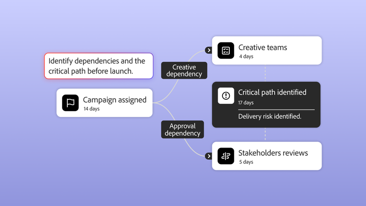
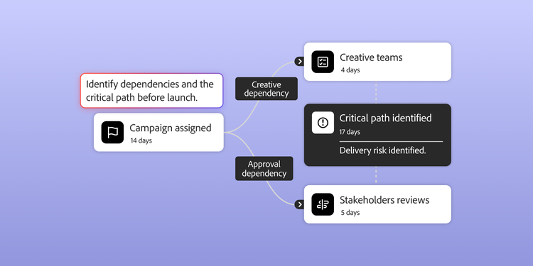
A PERT chart maps a project as a network diagram. Each task is represented by a node – such as a circle or rectangle – with arrows connecting the nodes to indicate task sequence and dependencies.
Once complete, a PERT chart provides a full view of the project, including time estimates for each task and the sequence in which they should be tackled. Teams can identify potential bottlenecks and determine the critical path – the chain of dependent tasks estimated to take the longest overall time.
PERT charts are typically created before a project begins, enabling teams to assess the full scope, identify potential issues, and establish an appropriate timeline. This sets them apart from the Gantt chart – another project planning tool – which organisations primarily use to monitor project progress. PERT charts also provide insights that Gantt charts often do not, including a clearer depiction of task hierarchies and interdependencies, as well as estimates for overall timeline and variability.
The four time estimates of PERT
One of the distinctive features of a PERT chart is its ability to accommodate uncertainty. Rather than relying on a single deadline, PERT charts use a weighted average of four time scenarios to calculate a realistic expected duration.
When using a PERT chart, there are four types of timeline:
Expected time = (O + 4M + P)/6
You can also calculate the variance as (P-O)/6 to estimate how far the actual time may deviate from the expected time.
PERT chart vs. Gantt chart
While both are valuable, they serve different phases of the project lifecycle:
- PERT charts are typically created before a project begins. They are used for planning, estimating timelines, and mapping out dependencies.
- Gantt charts are primarily used during a project. They focus on scheduling, resource allocation, and monitoring progress against specific dates.
How to create a PERT chart: A six-step process
Follow these steps to build an effective PERT chart for your project.
1. Identify milestones and project tasks.
The first step is to break the project down during the project planning stage. Begin with the final deliverable and work backwards, identifying every major milestone and the constituent tasks required to achieve them. Engaging all project stakeholders is essential for setting expectations, aligning on goals, and agreeing on the overall project outcome.
2. Determine task dependencies.
Task dependencies are tasks that rely on the completion of another task. The key is to identify which tasks must happen in sequence and which can occur independently. For instance, content teams may review personalised net new content to ensure it aligns with brand standards and legal compliance. Task dependencies can be incorporated into work breakdown structures. PERT charts visualise the dependencies within each task, providing a clear picture of the relationships between tasks.
3. Estimate project time frames.
Apply the expected time formula to each task. Consulting the teams who contribute to a task about their expected timelines is essential. Once you have engaged with the teams carrying out the work, share the expected time frames with senior leaders to ensure alignment on project execution. Teams can also use the critical path method (CPM), which identifies the key activities in a process and evaluates the time required to complete them.
4. Convert your tasks and milestones into nodes.
Start by arranging each task and milestone on a large diagram to begin building the chart. Nodes should represent these tasks. Bear in mind that as you move on to the next step, you may need to reposition the nodes, so sketching things out on a whiteboard or in a computer program will make this considerably easier.
5. Draw vectors between tasks.
Using your notes on task prerequisites and interdependencies, draw arrows between your nodes to indicate which tasks form dependent chains. Bear in mind that parallel chains are possible where some tasks do not affect others. You may also wish to include time estimates on the nodes or the connecting arrows, enabling you to calculate the overall project duration at a later stage.
6. Analyse and optimise task progress.
Once the chart is drawn, calculate the total time for each path and identify the critical path – that is, the longest duration. Look for opportunities to break up lengthy tasks or redirect resources to parallel workflows to optimise the schedule. For example, a team might identify bottlenecks that are preventing task progress. Reducing the number of steps within a project and limiting the number of contributing teams can help prevent projects from stalling.
Benefits of using PERT charts
The case for building this diagram is clear. PERT charts reveal insights that standard lists overlook, particularly around efficiency and risk management.
- Clarify critical paths: It identifies the longest chain of dependent tasks. If any task on the critical path is delayed, the entire project is delayed. Knowing this enables managers to prioritise those specific tasks.
- Reveal parallel workflows: It becomes straightforward to identify which tasks are independent of one another. Where resources permit, these tasks can be completed simultaneously – in parallel – to shorten the overall project timeline.
- Enable ‘what-if’ analysis: Once mapped, you can test different scenarios. What if the supply chain is delayed? What if we add more staff to Task C? This enables proactive risk management.
- Coordinate departments: By visualising dependencies, different teams (such as Dev and QA) can see why their deadlines matter to the wider project, fostering stronger collaboration.
Visualising a path forward
As a project manager, you handle a wide range of responsibilities – from stakeholder communication to crisis management. Adding PERT charts to your toolkit gives you the confidence to plan effectively, turning complex challenges into a structured, visual and achievable plan. Adobe Workfront can support you in managing these responsibilities as you plan and organise projects of varying complexity and scale. Having the right tools – and knowing how and when to use them – is essential. We hope this article proves useful as you expand your project management toolbox to include PERT charts.
Take a Workfront product tour to discover how our software makes building PERT charts straightforward and intuitive.
Recommended for you
https://business.adobe.com/fragments/resources/cards/thank-you-collections/workfront