Why a localised colour strategy matters for global ad campaigns and how to build one.
07-22-2026
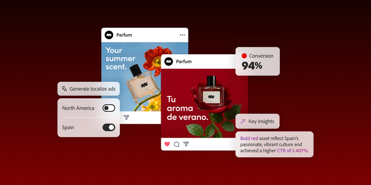
Culturally relevant localised ads resonate with users and can deliver higher conversion rates compared to non-localised ads. The same creative assets and content don’t perform equally well in every market and in many cases, adaptation isn’t good enough. For example, Pepsi’s advertising slogan “Pepsi Brings You Back to Life” was translated to “Pepsi Brings Your Ancestors Back from the Grave” in Chinese, rendering the ad culturally inappropriate. As global ad campaigns travel across regions, they must adapt effectively to local audiences. This often involves a holistic approach, including fine-tuning messaging and changing backdrops to reflect local cultural nuances. But beyond these obvious adjustments, there’s another often-overlooked aspect of localisation that can shape how people feel about an ad even before they read a word. It is known as a localised colour strategy.
Colours have a strong psychological impact that can evoke a response. When used strategically, they help foster a more meaningful connection with the audience. Foundational marketing research has long shown that customers form their first impression of a product within 90 seconds and 62%-90% of that judgement is based solely on colours.
Despite this, many campaigns still treat colour as a purely aesthetic choice rather than a performance driver. While enterprise teams prioritise language localisation, they often give far less attention to visual localisation. This leaves colour as an underutilised lever, leading to missed marketing opportunities.
Enterprises that seek stronger regional engagement need an effective approach to colour localisation. A data-driven framework can help them build a comprehensive strategy that moves beyond assumptions and uses colour intentionally across regions. Moreover, when powered by AI, scaling localised content becomes even more efficient. The result is small changes that translate into a measurable impact, at scale.
To understand how to develop and implement an effective localised colour strategy for enterprise ad campaigns, let’s dive into a few key areas:
- Why colour is an important part of a localisation strategy
- How ad performance data reveals regional colour preferences
- How to build a localised colour strategy for regional markets
- How to develop a colour localisation brief
- How AI-powered batch colour grading helps localise ads at scale
- How to turn colour localisation into a competitive advantage
Why colour is an important part of a localisation strategy.
Colour carries meaning, evokes emotion and influences behaviour in ways that vary across cultures. Research in colour psychology consistently shows that people’s preferences for specific hues, levels of saturation and colour temperatures depend on their environment and learnt associations.
For instance, in many East and South Asian cultures, bold colours such as red are associated with prosperity, celebration and good fortune. In many Western countries, blue is commonly associated with trust, stability and professionalism, making it a popular choice in corporate branding. Beyond differences in the cultural prominence of certain colours, even the meaning of colour is not universal and the same colour can drive different emotions across regions. In many countries, such as the United States (US) and the United Kingdom (UK), green is associated with nature, health and growth, while in Japan, it is also associated with vitality, harmony and youth.
A campaign built on a single, global colour strategy risks missing the emotional mark in multiple regions. The opportunity here extends beyond creative impact to deliver tangible business results. For enterprises running campaigns across multiple markets, investing in color localisation can increase ROI, as even small performance gains in each region can add up to significant revenue at scale.
For example:
- Click-through rate (CTR): A 1% CTR on an US campaign that uses a blue colour palette with five million impressions translates to 50,000 clicks. In a subsequent US campaign, the colour palette is changed to green and CTR increases to 2%, leading to 100,000 clicks. If 5% of those clicks become qualified leads, 5,000 prospects will enter the sales pipeline.
- Engagement rate: A 3% increase in engagement rate on a campaign reaching two million users results in 60,000 more interactions.
- Lower acquisition cost: Higher engagement rates signal that creative assets are very relevant, which can help lower customer acquisition costs and improve return on ad spend (ROAS).
- Long-term customer value: More relevant creative can lead to increase in brand recall, even if modest, which typically contributes to stronger conversion, repeat purchases and customer lifetime value (CLV).
For enterprise teams, thoughtfully calibrated colour choices can become a low-friction way to unlock performance gains across regions.
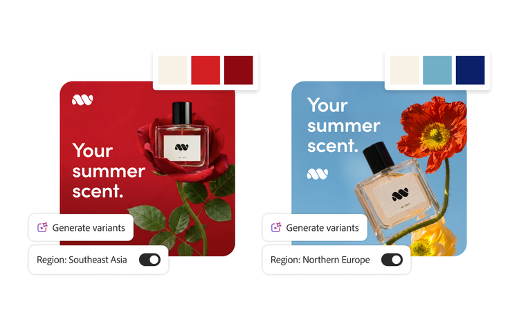
How AI-powered workflows make colour localisation more cost-efficient.
What makes colour localisation even more compelling today is how much easier it is to execute. AI-powered workflows enable batch production of creative variations, reducing the time and effort required to adapt assets for different regions. As production costs per asset decline, teams can experiment and refine the content supply chain without stretching budgets.
This creates room for more strategic iteration while maintaining global brand consistency, making colour localisation both practical and accessible. As a result, enterprises can stay competitive by meeting consumer expectations for culturally relevant content.
How ad performance data reveals regional colour preferences.
Every campaign can generate insights that help teams understand what may resonate visually across regions, including colour preferences. Teams that run A/B or multivariate tests with colour variations have the clearest advantage. Historical campaign performance data can reveal useful creative intelligence as well.
Key metrics that reveal colour preferences:
- CTR: Decodes the visual appeal of your creatives and identifies whether certain colours are more effective at grabbing attention in specific regions.
- Engagement rate: Reflects which colour palettes consistently invite interaction across markets.
- Conversion rate: Reveals which colours not only capture attention but also drive actions in local markets.
- View-through rate (VTR): Indicates which colour palettes consistently keep audiences engaged with video ad content through to completion in different markets.
Colour performance is rarely universal. It’s largely shaped by cultural context, audience behaviour and regional preferences. Campaign performance insights help identify these market-specific distinctions and inform more effective colour decisions.
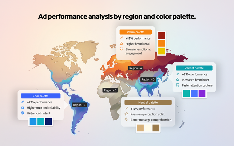
How to build a localised colour strategy for regional markets.
Many enterprise teams still rely on historical knowledge when choosing regional colour palettes, often at the expense of market resonance. Analysing colour choices through multiple lenses can help you move from cultural generalisations to uncover nuanced, region-specific insights. Understanding which colours resonate better with each targeted age group, gender or specific community for an ad campaign can make a significant difference. Validating colour preferences of potential customers with ad performance data alongside repeated testing is how you build a localised colour strategy.
However, this requires a starting point. Begin by developing hypotheses based on research and common observations, then test them across geographies. These hypotheses should not be treated as fixed rules, but as a direction to your initial approach. While multiple regional aspects can influence colour perception in different geographies, localisation strategies typically focus on the aspect most relevant to a given campaign, while incorporating other aspects as needed.
Here’s how it looks like in action:
- In tropical regions (Southeast Asia), high-saturation warm colours (reds, oranges and yellows) may be worth testing due to constant exposure to bright natural light.
- In low-light, colder regions (Nordics), muted and cooler tones (blues and greys) tend to resonate due to environmental adaptation.
- In the Middle East, where design traditions emphasise intricate patterns and rich, ornamental palettes (especially blues and golds), visually dense and saturated colour compositions may outperform minimal layouts.
- In Western Europe and North America, cleaner, restrained palettes rooted in modern minimalism tend to have improved performance.
- In Germany, blue-led creatives can garner a positive response in trust-based categories due to associations with reliability, security and professionalism.
- In Brazil, yellow and other warm tones may generate a stronger emotional response because they are often associated with optimism, energy and positivity.
- In Mexico, some campaigns have shown stronger performance with vibrant and high-contrast colour palettes, making them useful hypotheses for testing.
- In South Korea, more refined, balanced and contemporary colour palettes may resonate better because consumers often place a high value on design sophistication and visual polish.
It’s important to note that these observations only reflect broad cultural tendencies and may vary significantly depending on factors such as industry, audience segment, platform and specific domain. To surface meaningful patterns, you must further:
- Segment data by region, creative variant and colour theme while keeping copy, offer, audience and placement consistent.
- Focus on recurring trends across localised advertising campaigns rather than one-off spikes.
- Layer in qualitative signals, such as comments and reactions, to understand why colours resonate.
These performance insights will help you to form a strong foundation for future experiments and reduce reliance on intuition-based creative localisation.
Over time, you can build a data-backed view of what works in each key market. You can also identify how those patterns shift across campaign types, audiences and objectives. These insights can then be distilled into a clear, practical baseline playbook. Ultimately, your production workflow becomes faster, more focused and better aligned with what resonates in each local market.
How to develop a colour localisation brief.
To consistently bring out regional colour preferences across large-scale campaigns, you need a framework that supports scalable production. A regional colour brief is a structured document that turns performance data into clear, actionable creative guidelines for each market. It removes guesswork and ensures consistency across teams and assets.
In practice, a colour localisation brief looks something like this:
The goal is to make colour decisions traceable back to regional performance data, making the brief actionable for automated production.
How AI-powered batch colour grading helps localise ads at scale.
Once the colour localisation brief is ready, the next step is to establish an automated workflow that translates those guidelines into scalable, efficient production. Batch colour grading is an AI-powered process that implements predefined colour rules across large volumes of creative assets. It ensures consistency at scale while streamlining production workflows. Converting data-driven colour decisions into automated colour variants enables efficient adaptation across formats and markets.
It operationalises regional personalisation by:
- Applying standardised colour adjustments across entire asset libraries.
- Maintaining visual consistency across channels (video, display and social media).
- Reducing the time and resources needed to modify creatives.
Human review remains essential to confirm that localised variants meet brand standards, accessibility requirements and cultural expectations. Batch colour grading turns localisation from a manual bottleneck into a repeatable, scalable system. Discover how automated asset production helps you to achieve up to 8.5x net ROI over three years.
Overall, an end-to-end production workflow connects insight generation with strategic execution and, at the same time, scales creative productivity into a continuous loop of testing and optimisation. It often looks like:
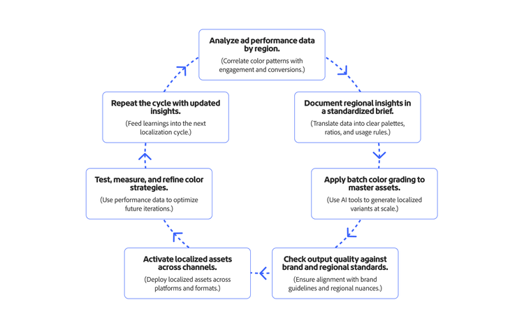
Over time, continuous feedback from performance data refines the approach, making localised ads increasingly effective. In a world where people constantly filter what feels relevant from what doesn’t, small details matter more than ever.
How to turn colour localisation into a competitive advantage.
To become part of a culture, brands must earn their place by understanding people deeply enough to reflect them authentically. As they expand across markets, they must focus on relevance just as much as reach. Colour is a powerful cultural signal — using it intentionally can be the difference between being noticed and remembered.
Enterprises are increasingly using generative AI to personalise ads. As this capability becomes more accessible, competitive advantage is shifting toward the finer details of customer experience, including colour localisation. By combining data-driven insights with scalable creative operations, enterprises can deliver more regionally relevant experiences, build stronger audience connections and increase the impact of ad campaigns.
Explore how Adobe Firefly Creative Production for Enterprise helps bring this vision to life by empowering teams to apply data-derived colour variations at scale through AI-powered workflows.
Recommended for you
https://business.adobe.com/fragments/resources/cards/thank-you-collections/firefly