
Ever finish a brainstorming session or user research phase feeling overwhelmed by a mountain of sticky notes, ideas, and observations? You know valuable insights are hidden within, but making sense of the sheer volume feels like trying to solve a puzzle in the dark. This is a common challenge, but the affinity diagram is a powerful technique designed to bring order to this chaos.
In this guide:
What is an affinity diagram?
An affinity diagram, also called an affinity map, organizes outputs from various sources by grouping them based on similar characteristics or relationships. Affinity diagrams help leaders make sense of large amounts of data or feedback and better understand their importance within the larger context of a project or initiative.
Affinity diagrams were created by Kawakita Jiro in the 1960s as a project management tool. Originally used to sort through the ideas generated during brainstorming sessions, these diagrams evolved to group like items together and help teams simplify issues, identify patterns, and solve problems without being overwhelmed by information.
Affinity diagrams are helpful when faced with disorder or vast amounts of data points that are difficult to organize and draw conclusions from. They can also be extremely useful in group situations where a few contributors or data sources (or both) come together with little to no organization. Affinity diagrams can easily be created using on-hand office supplies, including whiteboards or Post-it Notes, to allow items to be jotted down and moved between categories as they are discussed.
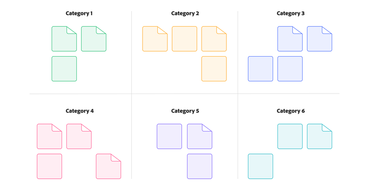
A great way to visualize an affinity diagram is to use an assortment of Post-it Notes, each with a different term or item listed, placed on a board and grouped based on their similarities.
How to create an affinity diagram.
The affinity diagram process is straightforward but requires discipline, especially during the sorting phase. Here’s a detailed guide.
Step 1: Generate and record ideas and data.
Start by identifying the source of your input. This could include ideas from a prior brainstorming session, user interview transcripts, survey responses, or any other source of raw qualitative data. Once you’ve gathered the input, record each distinct idea, observation, quote, or fact onto a separate sticky note. Each note should capture a single thought and be kept brief, ideally just three to seven words for clarity and ease of grouping.
Use clear, legible markers to ensure all team members can read the notes from a distance. When the ideas have been recorded, display them randomly on a prepared surface. Avoid pre-sorting or grouping at this stage, as random placement ensures the entire team can engage with all the inputs equally.
Step 2: Group ideas by affinity.
With all the ideas visible, begin the silent sorting phase. During this part of the process, team members work simultaneously and without speaking, moving notes around to form groups based on perceived relationships or thematic similarity. This "gut feel" sorting helps prevent groupthink and allows intuitive patterns to emerge organically.
There are a few important guidelines to follow during silent sorting. First, silence is essential for allowing each person’s perspective to influence the outcome independently. Second, everyone is free to move any note at any time. If someone disagrees with a placement, they can simply relocate the note. Creating a duplicate is acceptable if a note seems relevant to more than one group. Some notes may not fit into any group, and leaving those “loners” aside for now is okay.
Continue the sorting until most of the notes have been grouped and activity slows down naturally, signaling that the core themes have taken shape.
Step 3: Discuss, refine, and label groups.
After silent sorting, shift into a facilitated discussion. The team should review each group, discuss why certain notes are clustered, and surface any disagreements or unclear placements. This discussion is where patterns are clarified and meaning starts to solidify.
Once consensus is reached on groupings, collaboratively create header cards for each cluster. These headers, often on a different-colored sticky note, should clearly capture the shared theme or central idea that unites the notes in that group.
Step 4: Structure and finalize the diagram.
Now that your themes are established, arrange the grouped clusters and their headers on the surface in a logical layout. Consider the relationships between themes, workflows, or categories that make sense for your objective. For more complex datasets, you may want to group similar clusters into higher-level categories or “supergroups” to add a visual hierarchy.
Wrap up the session with a final team review. Ensure everyone agrees with the structure, labeling, and takeaways. Then, document the final diagram, take clear photos or digitize it if needed, and share it with relevant stakeholders or teams. This step ensures the insights generated during the session lead to actionable outcomes and can be referenced in future planning or decision-making.
When to use an affinity diagram.
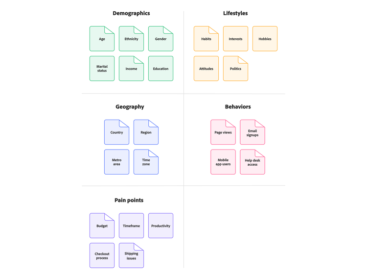
Affinity diagrams are most helpful when dealing with many ideas or issues that must be organized to address them efficiently and productively. These maps are broken down into single items, tasks, ideas, or data points that can be rearranged under common headings or categories to better understand the patterns and approach needed.
This organizational method can also help with brainstorming sessions, where ideas must be seen and structured based on group consensus.
Here are some of the most common use cases for affinity diagrams:
- Organizing brainstorming sessions
- Sorting survey results
- Understanding customer data
- Gaining group consensus on a project
- Demystifying large or complex ideas
- Consolidating chaotic facts or feedback
- Creating a product or project roadmap
Affinity diagram examples in action.
Here are some practical examples to illustrate the versatility of affinity diagrams:
Analyzing customer feedback.
Scenario: Synthesizing notes from user interviews about a new fitness app.
Data points: “Couldn't find workout history.” “App crashes during runs.” “Wish I could share progress.” “Subscription is too expensive.” “Confusing navigation menu.”
Grouping process: Notes about crashes and performance issues are grouped, notes about finding features are grouped, notes about cost are grouped, and notes about social features are grouped.
Resulting themes: “Performance and bugs,” “Navigation and usability,” “Pricing concerns,” “Feature requests.”
Actionable outcome: Insights highlight critical bugs to fix, usability issues in navigation to address, and potential new features to explore, informing the product backlog.
Organizing marketing campaign ideas.
Scenario: Brainstorming ideas for a holiday marketing campaign.
Data points: “Social media contest,” “Email discount code,” “Influencer collaboration,” “In-store event,” “Targeted Facebook ads,” “Blog post series.”
Grouping process: Clustering ideas by channel (social, email, in-store) and tactic (contest, discount, content).
Resulting themes: “Social media tactics,” “Email marketing,” “In-store promotions,” “Content marketing.”
Actionable outcome: A structured overview of potential campaign elements, facilitating planning and resource allocation.
Grouping project requirements.
Scenario: Gathering initial requirements for a new internal software tool.
Data Points: “Needs user login," “Generate monthly reports,” “Integrate with Salesforce,” “Must be mobile-friendly,” “Track task status,” “Admin user roles.”
Grouping Process: Clustering notes related to user access, reporting features, integrations, platform requirements, and core functionality.
Resulting Themes: “User Authentication,” “Reporting Capabilities,” “System Integrations,” “Platform Requirements,” “Core Task Management.”
Actionable Outcome: An organized list of requirements, forming the basis for the project scope and backlog.
Benefits and use cases of affinity diagrams.
Affinity diagrams are more than just an organizational tool. They offer significant benefits for teams tackling complex challenges.
- Tame information overload. Effectively structure and make sense of large volumes of qualitative data from brainstorming, surveys, interviews, or research.
- Uncover hidden patterns and themes. Grouping related items reveals underlying connections, trends, and insights that might otherwise be missed.
- Facilitate group consensus and collaboration. The process encourages participation from diverse team members, uses collective knowledge, and helps build shared understanding and consensus.
- Stimulate creativity and new perspectives. The intuitive, often silent, sorting process can break down conventional thinking patterns and spark fresh ideas.
Common use cases.
Affinity diagrams are versatile and valuable across many business functions:
- UX research. Synthesizing user interview notes, usability test feedback, and identifying user pain points or needs.
- Project management. Organizing project requirements, brainstorming risks, planning project phases, or analyzing lessons learned.
- Marketing strategy. Analyzing customer feedback, grouping campaign ideas, or identifying market trends.
- Process improvement and problem-solving. Grouping potential causes or solutions identified during brainstorming is often used within frameworks like Six Sigma.
Tips for effective affinity diagramming.
To get the most value from your affinity diagramming session, consider these practical tips to guide collaboration, surface meaningful insights, and drive action.
- Effective facilitation. A good facilitator guides the process, ensures participation, manages time, and helps the team navigate discussions after silent sorting.
- Choose physical vs. digital. Physical sticky notes encourage movement and tactile engagement. Digital tools are better for remote teams, have easier documentation, and handle huge datasets. Consider your team’s context.
- Embrace the silence. Don’t underestimate the power of the silent sorting phase. It prevents groupthink and allows intuitive connections to surface.
- Focus on “gut feel.” Encourage quick sorting based on perceived relationships rather than over-analyzing during the initial grouping phase.
- Action plan is key. The diagram itself is a means to an end. Ensure the insights lead to a concrete action plan.
Getting started with affinity diagrams.
Affinity diagrams are a remarkably effective yet simple technique for transforming large amounts of unstructured qualitative data into organized, actionable insights. Whether you’re analyzing user feedback, organizing brainstorming results, planning project tasks, or working within a Six Sigma framework, the affinity diagram process fosters collaboration, uncovers hidden patterns, and provides clarity amidst complexity. By embracing this method, teams can move beyond surface-level observations to a deeper understanding, paving the way for more informed decisions and impactful solutions.
Ready to bring order to your team’s ideas? Adobe Workfront can help manage the projects and action plans that arise from your affinity diagramming sessions, ensuring those valuable insights turn into real results.
Watch the overview video to learn more about how Workfront can help your planning initiatives.
Recommended for you
https://business.adobe.com/fragments/resources/cards/thank-you-collections/workfront
