Data-Driven Design: Turn Website Metrics into AI Prompts

How to translate website metrics into AI design prompts.

Website performance data can tell you where users struggle. It can't tell you what to redesign.

An analytics dashboard may highlight that visitors are leaving a page too quickly, abandoning forms, ignoring the call to action (CTA), or dropping out of the conversion journey altogether. But it cannot accurately identify what needs to be reworked.

At the same time, design teams can fast-track creative production with generative AI tools but miss visual optimization opportunities. This creates a gap between understanding what happened, identifying areas that need improvement, and making changes.

High-performing teams bridge this gap by translating performance data and UX analytics into design hypotheses before generating creative variations to test usability.

Read on to explore how to turn website metrics into clear creative direction and use AI prompts for expert web design.

This article discusses the following:

What data-to-design means.

Data-to-design is the process of translating website performance signals into data-informed design decisions. Rather than treating a metric as an instruction, you interpret the data, identify a likely user concern, and convert that insight into a creative design direction that can be explored, tested, and refined. This approach helps analysts, marketers, designers, and AI tools develop assets based on a shared understanding of the problem.

Data-driven design vs. data-informed design.

Although the terms are often used interchangeably, they represent different approaches to optimization.

Data-driven design uses metrics and behavioral signals to guide decisions. Bounce rates, engagement levels, scroll depth, form abandonment, and conversion rates help teams identify potential friction points. However, metrics reveal only patterns and rarely tell the full story.

Data-informed design goes a step further. It combines quantitative signals with qualitative research, audience needs, business context, accessibility requirements, and human judgment, so teams do not overreact to a single metric in isolation.

This distinction becomes even more important when AI enters the workflow. As AI tools need context, constraints, and clear objectives, they cannot reliably infer the best design solution from a metric alone.

Website metrics need to be translated into insights.

Website metrics reveal patterns in user behavior, not their underlying causes.

A high bounce rate, a low CTA click-through rate, or a spike in form abandonment can indicate a problem. But each metric represents a symptom rather than a diagnosis.

The table below highlights why interpretation matters.

Understanding the gap between data signals and user insights

Metric performance
What it tells you
What it doesn't tell you
High bounce rate
Users leave quickly.
Why they leave.
Low scroll depth
Users stop progressing through the page.
Whether relevance, content structure, or design is responsible.
Low CTA clicks
Users are not converting.
Whether trust, hierarchy, messaging, or placement is the issue.
High form abandonment
Users are not completing the form.
Which specific friction point caused them to leave.
Low conversion rate
Users are not reaching the desired outcome.
Which stage of the journey needs improvement.

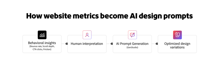
Instead of prompting an AI tool with raw performance data, teams should translate metrics into structured design direction and validate the output.

Analysts identify the performance signal, segment the data, and examine supporting evidence, such as session recordings, heatmaps, surveys, usability testing, and customer feedback. Designers determine which design changes best address users’ problems while aligning with brand standards and accessibility requirements. An AI tool can then generate design options based on that direction.

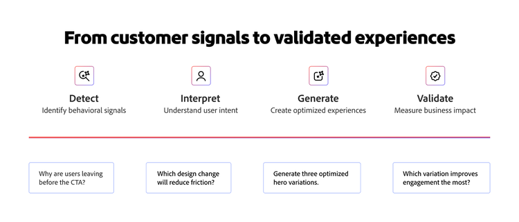
Translating metrics into design insights.

Four-step workflow showing how customer signals are translated into optimized experiences.

By failing to identify accurate design performance insights from reporting platforms, teams risk jumping from performance data to creative execution without fully understanding the problem. Teams have dashboards full of signals, but no repeatable way to turn them into design decisions that an AI tool can act on.

A simple framework can help bridge that gap: Signal, Friction, Design Move, Prompt, and Validation. Each step turns the output of the previous one into the input for the next, so a bounce-rate number eventually becomes a specific, testable design change.

Signal

A signal is the metric or behavioral pattern that suggests an experience may not be performing as intended. It helps you identify where users are encountering obstacles, losing interest, or abandoning a journey.

Common website signals include:

  • High bounce rate
  • Low engagement rate
  • Low scroll depth
  • Low CTA click-through rate
  • Low conversion rate
  • High form abandonment
  • High checkout drop-off
  • Rage clicks or dead clicks
  • Poor Core Web Vitals scores
  • Low mobile engagement

Example: Analytics show a landing page has a high bounce rate and low CTA click-through rate, specifically users coming from paid search.

AI can assist at this stage by scanning multiple data sources at once: analytics, heatmaps, UX session recordings, and surfacing which signals cluster together or spike for a particular segment. This allows teams to spend less time searching for the issue and more time interpreting it.

Friction

Friction is the likely reason users get confused, distracted, or discouraged from acting. This is where human interpretation becomes essential. Teams must combine analytics with qualitative insights to develop informed hypotheses about where users are getting stuck.

Users are likely to abandon a website for any of the following reasons:

  • Didn’t understand the offer quickly enough.
  • Couldn’t identify the next step in their journey.
  • Couldn’t trust the page or the organization behind it.
  • Overwhelmed by excessive content or too many choices.
  • Distracted by competing visual elements.
  • Couldn’t complete a form efficiently.
  • Had to wait for a long time for the content to load.

Example: Session recordings show visitors landing on the page, scanning the hero, and leaving without scrolling. The offer not being clear at first glance, or the CTA visually competing with supplementary content could be reasons for friction.

AI can help by summarizing patterns across large volumes of session recordings or feedback received. This type of qualitative testing is normally time-consuming to do at scale, but with AI, more time can be given to creating a hypothesis for the friction.

Design move

A design move is a specific action intended to reduce friction and improve user experience. It transforms insights into direction, giving generative AI tools a clear problem to solve rather than simply asking for a new design.

You can translate friction to a design decision by:

  • Simplifying the hero section.
  • Improving visual hierarchy.
  • Increasing CTA contrast and prominence.
  • Reducing content density.
  • Adding proof points near decision-making moments.
  • Grouping related form fields.
  • Using clearer labels and helper text.
  • Reducing heavy media above the fold.
  • Creating stronger mobile spacing and tap targets.

Example: In identifying the friction above, the design move may be to potentially simplify the hero, sharpen the headline for faster understanding, and increase CTA contrast to not compete with supplementary content.

This is where AI usage shifts from analysis to creation. It can generate concepts, multiple layout variations, and creative directions based on the design move. This gives teams varied options to compare, evaluate, and refine.

Prompt

A well-built prompt translates the design move into clear instructions. Create prompts that provide context, intent, and constraints. Instead of giving vague instructions, such as “improve the landing page” or “increase conversions,” treat each prompt as concise creative guidance.

Strong prompts typically include:

  • Audience type
  • Page type
  • Observed signals
  • Friction hypothesis
  • Design objectives
  • Accessibility or brand considerations
  • Desired outputs

Example of prompt: Act as a senior UX designer. Redesign the landing page hero for a B2B audience. The current page has a high bounce rate and low CTA click-through rates from paid-search traffic. Users are not understanding the offer quickly enough, and the CTA is visually competing with secondary content. Create a cleaner above-the-fold layout with a clearer headline, a single dominant CTA, stronger visual contrast, reduced copy density, and trust signals near the CTA.

It’s important to note that every line of the prompt maps back to a step in the framework. Audience and page type come from context, the signal and friction hypothesis come directly from those sections, and the design objectives are the design move, restated as instructions.

Validation and testing

Generating a redesign produces a version worth testing. Every design variation should be validated against the original signal and business objective to close the loop. Testing helps determine whether the proposed design genuinely reduces friction or simply looks different.

Depending on the original problem, success indicators may include:

  • Lower bounce rate
  • Higher engagement rate
  • Increased CTA clicks
  • Deeper scroll depth
  • More form starts and completions
  • Improved conversion rate
  • Fewer rage clicks
  • Higher mobile task completion

Example: If the redesigned hero is tested against the original and paid search visitors now bounce less and CTA click-through increases, the friction hypothesis is confirmed. The offer and CTA are more clear. If these metrics do not improve, it’s a signal to revisit the friction hypothesis and try again.

This iterative process is what separates data-informed optimization from guesswork. The goal isn't to generate more designs, but to develop better hypotheses, test them methodically, and learn which experiences help users more effectively.

How to translate common website metrics into generative AI design prompts.

Rather than treating metrics as instructions, translate them into likely user problems, design decisions, and prompt directions.

The examples below show how to develop a useful generative AI prompt based on a website performance signal.

High bounce rate: Strengthen the first impression.

A high bounce rate often indicates that visitors aren’t finding enough relevance, clarity, or value to continue exploring. While the metric alone doesn't reveal the exact reason users leave, it often points to issues with a page's first impression.

The design response should focus on what users see first — the hero message, value proposition, CTA hierarchy, and overall page clarity.

User experience issues and corresponding design improvements

Likely user problem
Design translation
Generative AI prompt direction
Users do not understand the offer quickly.
Clarify the headline and value proposition.
Make the page value clear within five seconds.
Users feel overwhelmed above the fold.
Simplify the hero layout and reduce competing elements.
Create a cleaner above-the-fold layout with fewer distractions.
Users do not trust the page enough to continue.
Add proof points, logos, ratings, or trust signals near the CTA.
Add concise trust signals near the primary action.

Example of prompt: Act as a senior UX designer. Redesign the above-the-fold section of this landing page to reduce bounce rate. Make the core value proposition clear within five seconds, simplify the layout, create one dominant CTA, increase visual contrast around the primary action, and add a concise trust signal near the CTA. Maintain brand guidelines and meet accessibility requirements, including WCAG 2.2 contrast standards and readable typography.

Low engagement rate: Improve relevance and interaction cues.

Low engagement often signals that users do not find the page useful, relevant, or compelling enough to interact with. The content may answer the wrong questions, key actions may be difficult to discover, or the experience may not provide a clear next step.

Improve relevance, interaction cues, and content discoverability to make the experience feel more useful and actionable.

User experience issues and corresponding design improvements

Likely user problem
Design translation
Generative AI prompt direction
Users do not see content relevant to their goals.
Strengthen audience-specific messaging and content hierarchy.
Surface the most relevant information earlier.
Users are unsure how to engage with the page.
Introduce clearer interaction cues and visual guidance.
Make next steps more obvious throughout the page.
The page feels static or overwhelming.
Break up content and create stronger visual rhythm.
Improve content for clarity and engagement.

Example of prompt: Act as a senior UX designer. Redesign this resource page for enterprise marketers. The page has a low engagement rate despite strong traffic volume. Visitors do not immediately find content relevant to their needs and are unsure how to continue exploring. Improve the content hierarchy, surface audience-relevant benefits earlier, introduce clearer interaction cues, and create a more engaging visual flow. Maintain accessibility requirements, responsive layouts, and adherence to design-system standards.

Low scroll depth: Make the page easier and more rewarding to scan.

Low scroll depth may indicate that users don't see enough value in continuing down a page. The content structure, hierarchy, or visual presentation may not provide a compelling reason for them to keep exploring.

Make progression feel clearer, easier, and more rewarding.

User experience issues and corresponding design improvements

Likely user problem
Design translation
Generative AI prompt direction
Users do not understand what comes next.
Improve section transitions and hierarchy.
Create stronger content progression cues.
Content feels dense or intimidating.
Reduce visual density and improve readability.
Make the page easier to scan.
Important content appears too late.
Surface key information earlier.
Reorganize content based on user priorities.

Example of prompt: Act as a senior UX designer. Redesign this long-form landing page to improve scroll depth. Users frequently leave before reaching key benefits and proof sections. Create a stronger visual hierarchy, improve section transitions, reduce content density, and introduce visual cues that encourage continued exploration. Ensure that layouts remain accessible, mobile-responsive, and easy to scan.

Low CTA clicks: Increase visibility, specificity, and confidence.

Weak CTA performance is rarely just a button-color issue. It often reflects broader problems with messaging, placement, hierarchy, trust, or decision confidence.

Help users understand why they should take action and what they'll receive in return.

User experience issues and corresponding design improvements

Likely user problem
Design translation
Generative AI prompt direction
Users do not notice the CTA.
Increase prominence and visual hierarchy.
Make the primary CTA more visually distinct.
Users are unsure what they will receive.
Strengthen CTA and supporting copy.
Clarify the value of taking action.
Users need more confidence before acting.
Add supporting trust signals.
Reinforce credibility near decision points.

Example of prompt: Act as a senior UX designer. Redesign this product landing page to improve CTA click-through rate. The primary CTA receives significantly fewer clicks than expected. Users either overlook the CTA or do not understand the value of taking action. Increase CTA prominence, simplify competing visual elements, improve supporting copy, and place trust signals near key decision points. Follow accessibility best practices, including clear focus states and sufficient color contrast.

High form abandonment: Reduce cognitive load and uncertainty.

Form abandonment often signals that the experience feels too long, complex, risky, or difficult to complete. Even small points of uncertainty can discourage users from proceeding.

Reduce cognitive load, minimize effort, and make the path to completion feel straightforward.

User experience issues and corresponding design improvements

Likely user problem
Design translation
Generative AI prompt direction
Form appears too long.
Simplify structure and prioritize essential fields.
Reduce perceived effort.
Users are confused by requirements.
Improve field labels and helper text.
Clarify what information is required.
Users hesitate to share information.
Reinforce privacy and trust messaging.
Reduce perceived risk.

Example of prompt: Act as a senior UX designer. Redesign this lead-generation form to reduce abandonment. Users frequently begin the process but do not complete it. Group related fields, simplify field layouts, improve labels and helper text, reduce perceived effort, and reinforce trust in data collection practices. Ensure that all form components support WCAG 2.2 requirements, including clear error messaging, explicit focus indicators, and accessible labels.

Low conversion rate: Strengthen the path from problem to action.

Unlike most metrics that point to a single isolated issue, conversion rate reflects the overall effectiveness of the user experience. Low conversion rates often stem from a combination of challenges related to messaging, trust, usability, content, and performance.

Focus on strengthening the entire user journey.

User experience issues and corresponding design improvements

Likely user problem
Design translation
Generative AI prompt direction
Users do not understand the value proposition.
Improve message clarity and alignment.
Strengthen the connection between problem and solution.
Users need more evidence before acting.
Introduce stronger proof points.
Increase trust throughout the journey.
The path to action feels unclear.
Strengthen progression and CTA hierarchy.
Create a more direct path to conversion.

Example of prompt: Act as a senior UX designer. Redesign this solution page to improve the conversion rates. Analytics suggest that users engage with the content but fail to take the next step. Strengthen the journey from problem awareness to action, improve benefit messaging, increase trust through proof points, simplify decision-making, and make progression toward conversion more intuitive.

Rage clicks or dead clicks: Make interactions clearer.

Rage clicks and dead clicks often signal broken expectations. Users may assume that an element is clickable when it isn't, or they may not receive sufficient feedback after taking an action.

Reduce ambiguity and make interactions feel more predictable and responsive.

User experience issues and corresponding design improvements

Likely user problem
Design translation
Generative AI prompt direction
Users expect an element to be clickable.
Improve affordances and visual cues.
Make interactive elements more obvious.
Users do not receive prompt responses.
Add clearer system responses.
Provide immediate confirmation for actions.
Navigation expectations are unclear.
Improve interaction patterns.
Reduce ambiguity throughout the interface.

Example of prompt: Act as a senior UX designer. Redesign this interface to reduce rage clicks and dead clicks. Analytics show repeated interactions with non-clickable elements and limited feedback after user actions. Improve affordances, visual interaction cues, and system feedback. Ensure that interactive elements are clearly distinguishable and that accessibility requirements are fully supported.

How to write an AI design prompt from website performance data.

The strongest AI design prompts look less like casual requests and more like concise creative briefs. A well-structured prompt gives AI the same context a designer would need before beginning work. This helps generate outputs that are relevant, usable, and can be tested.

The data-to-design prompt template.

Use the following framework when translating website performance data into an AI-ready design direction:

  • Role: Act as a senior UX designer specializing in [industry/use case].
  • Page context: Redesign a [page type] for [audience].
  • Metric signal: Analytics show [metric issue].
  • User friction hypothesis: Users are likely struggling because [cause].
  • Design goal: Improve [specific user outcome].
  • Design requirements: Include [specific design improvements].
  • Constraints: Follow brand guidelines.

Constraints could also list design system requirements, technical limitations, and accessibility standards. Incorporate accessibility considerations from the start, including color contrast, labeling, focus states, readable typography, and error guidance.

What to avoid when writing AI design prompts.

Weak AI prompts usually fail because they ask AI to "fix" a metric without providing enough context.

For example, a prompt such as “improve this landing page and reduce bounce rate” gives AI very little to work with. It identifies a metric but doesn't explain the audience, the user challenge, the business objective, or the desired outcome.

A stronger prompt provides context, direction, and constraints. It follows the framework defined earlier.

Avoid writing AI design prompts that:

  • Use a metric without a user-friction hypothesis.
  • Ask for vague improvements such as "make this page better."
  • Focus solely on aesthetics instead of user behavior and outcomes.
  • Ignore audience, device type, traffic source, or journey stage.
  • Leave out brand, design-system, technical, or accessibility constraints.
  • Treat AI-generated output as a final solution rather than a test case.

How to validate AI-generated design changes.

Generating a new design is not the end of the workflow. It's a hypothesis that needs validation.

To determine whether a design change improves the experience, combine quantitative and qualitative measures that align with the original problem you're trying to solve.

Depending on the original issue, validation methods may include:

  • A/B and multivariate testing
  • CTA click tracking
  • Engagement rate monitoring
  • Scroll depth analysis
  • Form start and completion rates
  • Conversion rate measurement
  • Rage-click and dead-click monitoring
  • Session recordings
  • User testing and usability studies
  • Accessibility QA reviews
  • Performance monitoring

Most importantly, measure success against the issue the redesign was intended to solve.

User experience issues and corresponding design improvements

Original issue
Metrics to monitor
High bounce rate
Engagement rate, bounce rate, and above-the-fold interactions.
Low CTA clicks
CTA click-through rate and downstream conversion quality.
Form abandonment
Form starts, field-level errors, completion rate, and qualified submissions.
Poor mobile engagement
Mobile-specific engagement, scroll depth, CTA taps, and form completion.

Effective validation considers both user behavior and business impact.

Accessibility should also be part of every validation plan. Even when accessibility requirements are included in the prompt, teams should verify color contrast, keyboard navigation, focus states, error handling, form labels, and screen reader support before deployment.

How to turn performance insights into better design direction.

While website analytics can tell you what users are doing, generative AI can help you explore potential solutions. The value comes from connecting the two.

Teams that consistently improve digital experiences don't move directly from metrics to design decisions. They translate performance data into a clear design direction and use AI to explore solutions they can test, validate, and refine.

As generative AI becomes a larger part of web design and creative workflows, the competitive advantage will not come from generating more design variations. It will come from asking better design questions and grounding every prompt in user behavior, performance data, and business context.

Adobe GenStudio helps teams put this approach into practice by turning performance insights into on-brand creative variations that they can generate, test, and optimize at scale.

Let’s talk about what Adobe can do for your business.

Get started


I'm the Adobe Assistant. How can I help you today?

1