A comprehensive guide to user flow diagrams
Understanding user flow analysis.
User flow analysis (also referred to as customer flow analysis) examines the transfer and movement of resources, information, or individuals through the various stages of a defined process or system. Its core purpose involves meticulously breaking down these processes into discrete steps to identify inherent inefficiencies, potential bottlenecks, or friction points that may impede productivity or hinder desired outcomes.
User flow diagrams focus intently on understanding precisely how materials, data, energy, or, increasingly, customers transition within a given environment. The insights gained enable engineers, analysts, and business leaders to implement targeted adjustments to enhance overall performance. The accuracy and thoroughness applied during flow analysis can significantly influence an organization’s capacity to meet its strategic objectives.
Effectively conducting user flow analysis requires adopting a perspective grounded in systems thinking. It moves beyond merely tracking a single, linear path. Understanding how different system components — such as website pages, application screens, marketing touchpoints, or customer support interactions — collectively influence user movement is a primary goal of user flow analyses. This approach recognizes that a user’s journey is rarely isolated but is shaped by the broader system’s dynamics. For instance, identifying a bottleneck on one page requires understanding its upstream causes and downstream effects within the overall site or application architecture.
What is user flow?
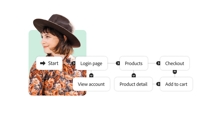
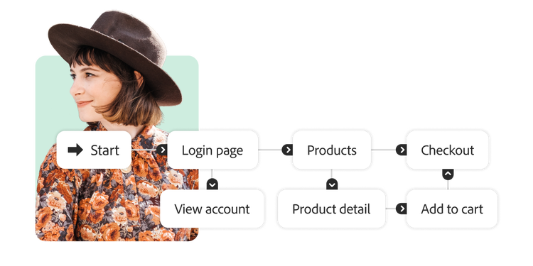
User flow is any path a customer could take through a website or application. User flow can also refer to a visualization or map of that journey, sometimes called a flowchart or a user experience (UX) flow. It maps movement through a product, illustrating every possible step a user could take from an entry point to the end of their engagement. The purpose of a user flow diagram is to help you identify where on your site or app you need to provide certain information that convinces users to take specific actions, moving them toward a successful final interaction.
What is the difference between user flow and customer journey?
Feature
User flow
Customer journey
What are the benefits of user flow diagrams?
User flow analyses include diagrams that serve as roadmaps to help you create an optimal user experience. User flow diagrams have several benefits:
- Visualizing how users navigate websites or applications
- Visualizing user experience
- Optimizing user flow
- Receiving team member feedback efficiently
Below, we will provide a detailed review of each benefit of user flow analyses and diagrams.
Visualize how users navigate.
Get a glimpse into your users’ experience as they navigate your website or app. It’s easy to get so familiar with your company’s product that the navigation and user experience seem simple, but that may not be the customer’s experience.
User flow diagrams and analyses help you see your site or app’s flow from a user’s perspective. You can observe what they encounter, identify friction and hurdles, find methods to make the experience seamless, and ensure you align your goals with your users’ needs.
UX visualization.
A user flow analysis can also provide a bird’s-eye view of your app and illustrate how every piece and page work together. It’s easy to focus on one part of the website for a specific project too and lose sight of the big picture. A user flow analysis visualizes the entire experience so you can optimize for every journey.
A user flow diagram illustrates how pages and steps work together to bolster or hinder a user’s experience navigating your product. This view lets you easily identify dead ends, orphaned pages, and poorly constructed paths.
One of the primary advantages is the ability to identify bottlenecks and friction points within the digital experience. Flow analysis pinpoints exactly where users encounter difficulties, slow down unnecessarily, abandon tasks, or exit the site or application altogether. Addressing these specific hurdles is fundamental to creating smoother pathways.
By systematically removing these identified bottlenecks and streamlining navigation, businesses can significantly improve efficiency for users attempting to achieve their goals, whether it’s finding information, completing a transaction, or using a feature. This directly contributes to an optimized user experience.
Optimizing your user flow.
User flow analyses are essential for experimenting with changes before pushing them live. If a navigation change is proposed or a new site section needs to be added, draw it into the user flow diagram first. This allows you to easily demonstrate and discuss where it fits, not just on the site architecture, but in the user’s journey.
Visualizing changes in the user flow keeps the app user-focused and helps your team catch problems before they launch. You avoid rushing untested changes that could seriously impact user flow and cost you considerable time and resources to fix after the fact.
Receiving team member feedback efficiently.
When consolidating feedback from multiple team members, especially non-UX colleagues in sales and marketing, a user flow analysis is an efficient way to centralize all insights. Since user flow diagrams are visual, they make it easier to demonstrate app navigation to stakeholders from all departmental backgrounds. A user flow analysis includes a diagram with a simple key of shapes, easy-to-follow paths, and minimal text so critical collaborators can easily offer their valuable feedback.
How to create a user flow diagram.
Making a user flow diagram requires user research, deep knowledge of your product’s value, and creative thinking. User flow diagrams are the primary component of user flow analyses.
- Understand your customer journey.
The first step to designing a user flow diagram is understanding your user and their customer journey.
You can get to know your users by creating engaging buyer personas. A buyer persona is a representation of a critical audience segment and can help you understand your users’ needs, wants, motivations, and behaviors. Buyer personas can help you determine what information to include on each page of your site that convinces users to navigate to the next step in the flow.
In addition to personas, consider building a customer journey map that outlines every step a customer takes with your organization, from introduction to purchase. Understanding the entire customer journey for each persona highlights where your website or app comes in. This can provide crucial insights for the UX it should offer. Users engaging with the website early in their customer journey will need a different user flow than personas interacting with the app toward the end of their journey.
- Identify and align your goal with your user’s goal.
Specific sections or pages of your website have different goals, such as making a purchase, subscribing to your newsletter, signing up for a free trial, or registering for a webinar. But these might not accurately reflect your users’ goals.
Identifying a user’s objective can be trickier, but you can reference the personas and customer journey map you’ve created. Examine customers’ pain points at the journey stages when they turn to your apps. Once you know your users’ goals, you can design or adjust the user flow to meet them where they are in their journey, deliver what they’re looking for, and take them to the endpoint you desire.
It may seem counterintuitive to start with the user’s goals rather than your own, but you have to know what users want before you can convince them to navigate to the end of your flow.
- Figure out how users find you.
Now that you know where your user flow ends, it’s time to figure out where it starts. Review your customer journey maps and make a list of all the ways users find you, your product, and your site. These are the many starting points of your user flow.
Some common entry points you may have in your user flow diagram include:
- Direct traffic
- Organic search
- Social media
- Paid ads
- Referral sites
- Press
How users enter your site will tell you a lot about their needs and how long they will take to reach your endpoint. For example, a user who reaches your site through direct traffic may already know what they want and head straight to your product, while a user who clicks on an ad may not be familiar with your brand and may randomly click around on your site.
- Determine what information your users need.
Next, you need to fill in the blanks between the endpoint and various starting points of your user flow to figure out exactly how to optimize your audience’s experience and lead people through your site. Use your buyer personas and customer journey map to determine these steps, which should address pain points, alleviate fears and doubts, and give buyers the information they seek.
For example, if potential customers consistently enter your website through a paid ad and then click over to the “About page,” it means your audience wants to know who they might be buying from. To streamline that user experience, you might include company info on the target landing page or create a clear CTA from the product page to the About page.
The timing of information is also crucial to ensuring users get what they need to move forward in the user flow. Consider what users want to achieve, what’s making them hesitate, and what questions they have at every stage. Then optimize the steps in your user flow to address those issues at the right time.
- Map and visualize the flow.
At this stage, you know what users need at every step of the user flow, from entry to the endpoint. Now, it’s time to visualize it. To map your user flow, you can use a physical or digital whiteboard or a software program that makes it easy to build and collaborate.
- Get feedback, refine, and finalize.
Once you’ve completed your user flow diagram, share it with other team members to get feedback.
Give it to stakeholders across your organization, including designers, developers, product engineers, sales reps, and marketing team members. All these perspectives can help you identify possible friction in the flow and find better ways to streamline and improve the user experience. Apply feedback and make changes as necessary.
Once approved, bring your finalized user flow diagram to the UX designers, web and software developers, and engineers who will turn this flow into a practical digital resource. They can test the user flow with actual users and apply that feedback to improve your website or app further.
User flow diagram best practices.
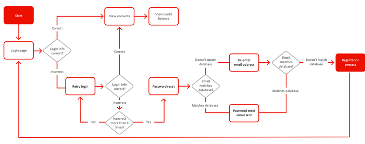
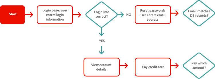
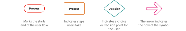
This simple UX flow communicates each step using universal shapes, symbols, and colors. Additional text along the arrow lines communicates the results of each decision, such as whether the login info is correct or whether the user clicked “yes” or “no.”
Creating effective user flow diagrams is crucial for communicating insights clearly and driving action. Adhering to established best practices ensures that visualizations are not just aesthetically pleasing but also accurate, understandable, and fit for purpose.
- Define audience and purpose. Before creating any visualization, clearly identify the intended audience, the specific question the visualization aims to answer, or the decision it intends to inform. Tailor the complexity and detail level accordingly.
- Select appropriate visualization types. Choose a chart or diagram that accurately represents the data and the explored relationships. While flow diagrams are specific to path analysis, general principles apply. Use bar or line charts for straightforward comparisons over time or across categories; avoid pie charts for numerous categories or precise comparisons. Use dedicated tools like the flow visualizations in Adobe Analytics or Adobe Customer Journey Analytics to analyze user paths.
- Prioritize simplicity and clarity. Avoid visual clutter. Remove non-essential elements like excessive gridlines, redundant labels, or purely decorative graphics. Utilize whitespace effectively to separate components and create visual structure. The primary focus should always be on making the data easy to understand, not elaborate design.
- Use color strategically and responsibly. Color should serve a purpose — differentiating categories, highlighting key data points, indicating intensity (as in heatmaps), or maintaining brand consistency. Use a limited palette, employ neutral primary colors, and use brighter accent colors sparingly for emphasis. Ensure color choices are consistent (for example, that the same color doesn’t represent different things) and accessible, considering users with color vision deficiencies.
- Implement clear labeling and titles. All essential components — axes, nodes, paths, segments — should be clearly and concisely labeled. Provide an informative title that summarizes the visualization’s main subject. Use tooltips or annotations to offer additional context or precise values without cluttering the main view.
- Use appropriate data scaling. Ensure scales accurately reflect the data. Bar chart axes should typically start at zero to prevent misrepresenting proportions. Choose between linear and logarithmic scales based on the data distribution and the story being told. Maintain consistent scales when comparing multiple charts side-by-side.
- Enable interactivity when possible. Modern analytics platforms often allow for interactive visualizations. Features like hover-over details, clickable nodes for drill-down, filtering options, and zooming empower users to explore the data themselves, ask follow-up questions, and gain a deeper understanding. Providing details on demand keeps the initial view clean, allowing for deeper dives.
- Provide necessary context. Visualizations rarely stand alone effectively. Accompany them with explanatory text that clarifies what the data represents, highlights key findings, and explains any nuances or limitations.
- Test for understanding. Whenever possible, test visualizations with representatives of the target audience to ensure they are interpreting the information correctly and that the intended message is clear. Iterate based on feedback.
Implement user flow analysis with Customer Journey Analytics.
Flow analysis, particularly when applied to customer behavior in digital environments, transcends simple path tracking to become a strategic imperative for modern businesses. It provides the essential lens through which organizations can understand how users navigate their digital properties, identify critical points of friction or opportunity, and ultimately optimize experiences to drive key business outcomes such as improved operational efficiency, higher conversion rates, and enhanced customer satisfaction and loyalty.
Customer Journey Analytics is instrumental in realizing the full potential of user flow analysis. It provides the sophisticated tools required for deep, flexible, and scalable investigation of user flows, including capabilities for interactive exploration, inter-dimensional analysis, robust segmentation, and, crucially, the integration of cross-channel data.
Investing in flow analysis methodologies and supporting technologies is a technical upgrade and a strategic commitment. The insights derived directly influence the digital customer experience, streamline operations, and ultimately contribute positively to the bottom line. Mastering flow analysis requires sharp analytical skills to interpret the data, proficiency with powerful tools like Customer Journey Analytics, and a persistent focus on understanding the customer within their broader journey context.
Adobe Customer Journey Analytics provides your business with vital data to develop customer journeys you can use to make user flow diagrams for your website or app.
Watch an overview video on how Customer Journey Analytics can help you build robust user flows by combining years’ worth of customer behavior data from every channel into a single interface.